This post may contain affiliate links. If you click and buy, we may earn a small commission at no extra cost to you. Learn more.
I’m thrilled to share my favorite color schemes that never go out of style! These timeless design approaches create magic in any home.
Walking into a beautifully designed space feels welcoming and sophisticated. It’s effortlessly elegant!
I love how these color schemes let your personality shine. Your artwork, accessories, and personal touches become the stars.
In this guide, I’ll share my top 10 color combinations. They’ll turn your space into a serene sanctuary. From classic beiges to sophisticated grays, these palettes fit any home style.
Whether you like modern minimalism or cozy traditional vibes, I’ve got you covered. I’ll share practical tips and insider secrets. Get ready to see how timeless design means beautifully balanced!
Contents
- 1 1. Classic Beige and Cream Combinations
- 2 2. Sophisticated Gray Color Schemes
- 3 3. Timeless White and Off-White Palettes
- 4 4. Greige: The Perfect Gray-Beige Blend
- 5 5. Earthy Neutral Living Room Designs
- 6 6. Navy and Neutral Combinations
- 7 7. Texture and Pattern in Neutral Spaces
- 8 8. Lighting Considerations for Neutral Palettes
- 9 9. Furniture Selection for Neutral Color Schemes
- 10 Creating Your Perfect Neutral Haven
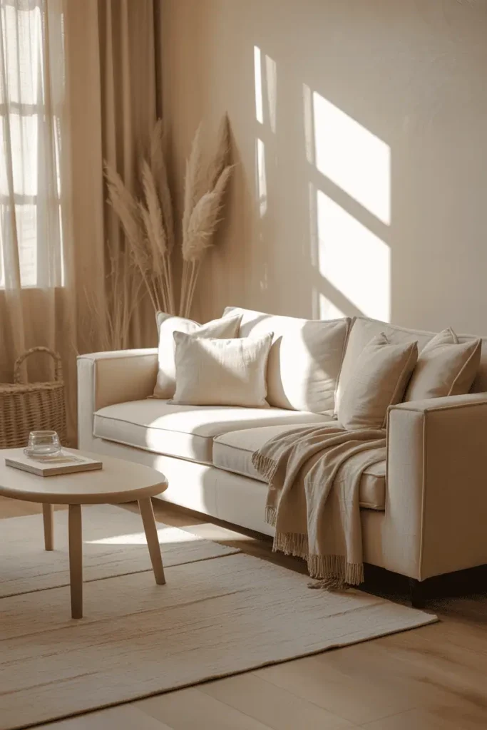
1. Classic Beige and Cream Combinations
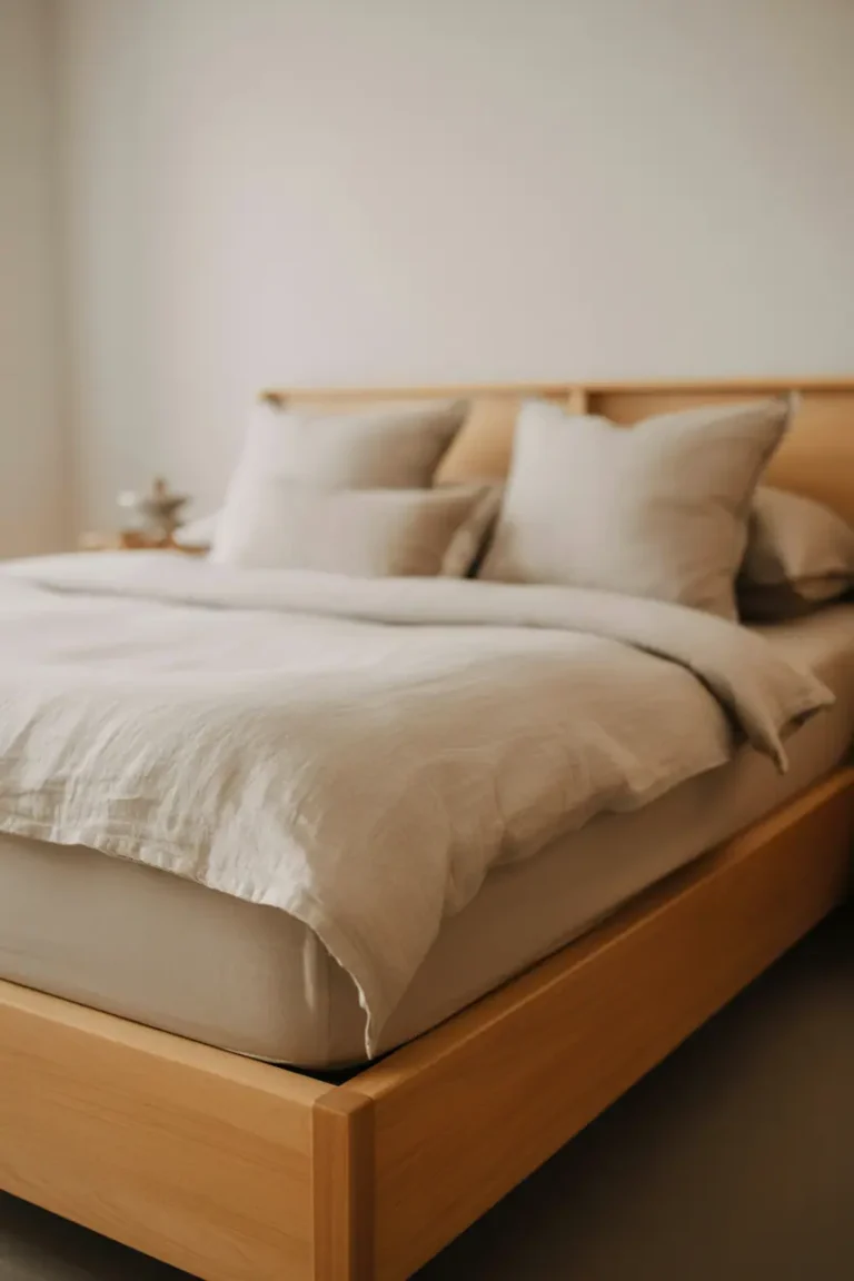
I love how beige and cream make any room look elegant. These timeless neutral color schemes are versatile and warm. A beige living room is perfect for showing off your style, whether it’s traditional or modern.

Warm Undertones That Create Coziness
Beige’s success comes from its undertones. Look for beiges with warm hints of yellow, pink, or peach. These colors make your space cozy and inviting.
Cool beiges with gray undertones are great too. They give a sophisticated, hotel-like feel. Choose undertones that fit your mood.
Layering Different Shades of Beige
Layering brings out the best in beige. I mix creamy wall colors with mushroom-toned furniture and camel accents. This adds depth without being overwhelming.
Try light cream walls with a deeper beige sofa. Add throw pillows in different beige shades. This avoids a flat look.
Accent Colors That Complement Beige
Beige pairs well with other colors. My top picks are sage green, dusty blue, and warm terracotta. They add warmth without taking over.
Soft whites contrast beautifully, while chocolate browns add sophistication. Always test colors in different lights, as beige changes with the day.
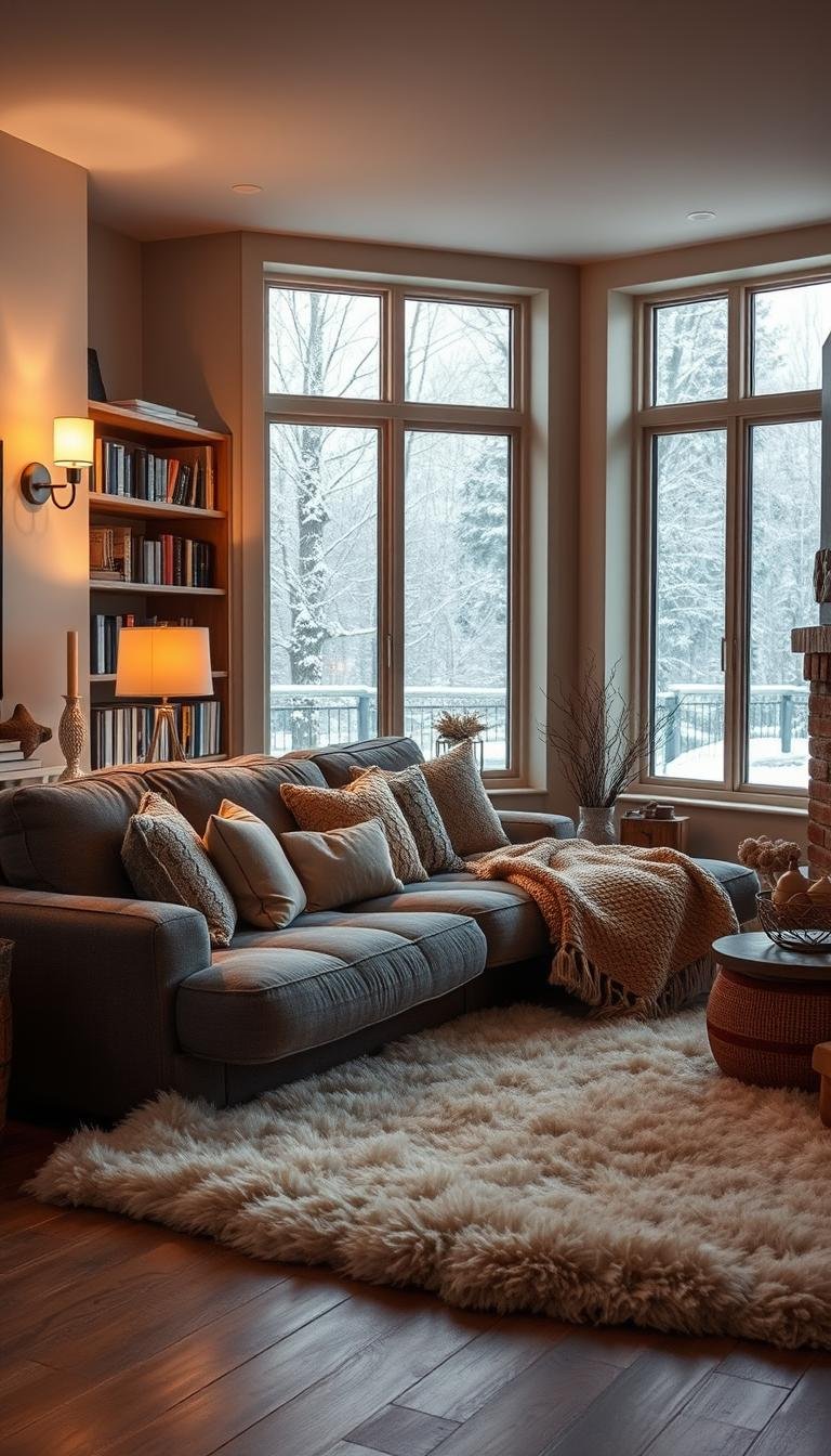
2. Sophisticated Gray Color Schemes
A gray living room adds elegance to your home. Gray is a versatile neutral that works well for both modern and timeless looks. It’s all about choosing the right gray tone to change your room’s feel.
Cool vs. Warm Gray Undertones
Gray undertones are key for neutral decor. Cool grays, with blue or green undertones, give a spa-like, modern vibe. They’re great for minimalist spaces, creating a clean, fresh feel.
Warm grays, with beige or taupe undertones, are cozy and inviting. They’re perfect for family rooms, adding sophistication without losing comfort.

Monochromatic Gray Approaches
I love monochromatic gray schemes! Using various shades adds depth and interest. Imagine a charcoal accent wall with a dove gray sofa and silver accessories.
It’s important to mix tones and textures to avoid a flat look. Layer different materials like velvet, wool, and metal for a lively feel.
Pairing Gray with Natural Wood Elements
Pairing gray with warm wood elements is a great trick. Try a reclaimed wood coffee table or oak shelves for that organic touch.
Gray walls with walnut furniture create a stunning look. Add greenery and metallic accents for elegance and warmth.
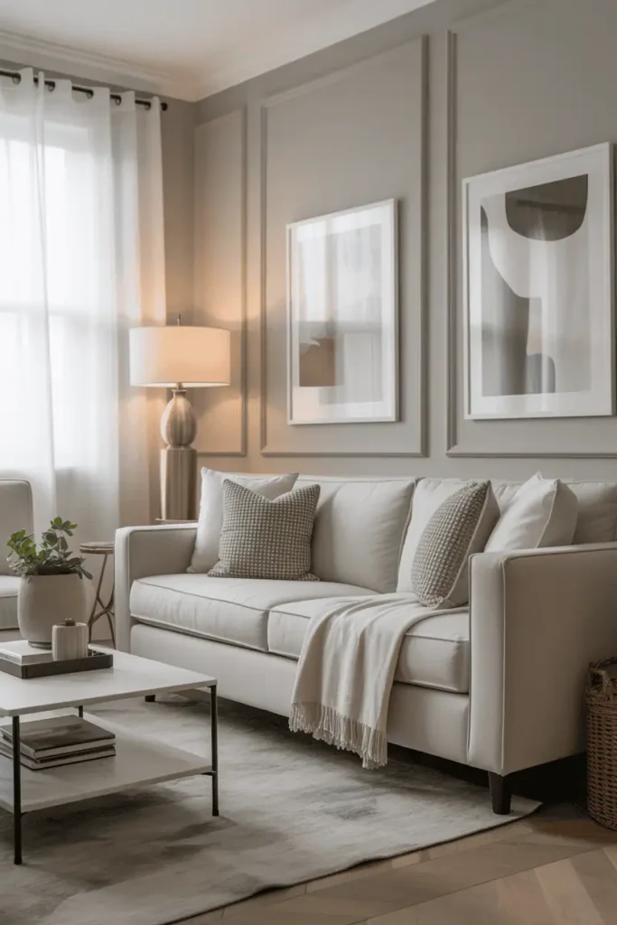
3. Timeless White and Off-White Palettes
I’m really into white and off-white colors because they make any living room calm and peaceful! These neutral paint colors turn spaces into serene, light-filled areas that feel refreshing. The best part is how versatile and timeless whites are.
Creating Depth with Multiple White Shades
The trick to amazing white rooms is using different white shades. I mix crisp white walls with creamy white trim and warm ivory furniture. Each shade adds its own touch, making the space look deep and sophisticated.
Try using pure white for ceilings, soft cream for sofas, and warm off-white for pillows. This neutral palette keeps your room from looking flat.

Avoiding the Sterile Look
To avoid a cold, hospital-like feel, pick whites with warm undertones. I choose neutral paint colors with hints of cream, gray, or yellow. These undertones warm up the space.
Natural materials are my go-to! Raw wood coffee tables, woven baskets, and linen curtains add warmth. They make white spaces feel cozy and inviting.
Incorporating Texture in All-White Spaces
Texture is key in all-white rooms! I mix chunky knit throws with smooth leather, rough jute rugs, and glossy ceramics. This adds interest without color.
Don’t forget plants! They add life to your neutral palette while keeping the calm, timeless vibe of white living rooms.
4. Greige: The Perfect Gray-Beige Blend
Working with greige is thrilling. It’s a mix of gray and beige that makes living room ideas come alive. This color has changed how I design with neutrals. It blends gray’s elegance with beige’s warmth perfectly.

Understanding Greige Undertones
The key to greige’s success is knowing its undertones. Some greiges are cooler, with more gray, while others are warmer, with more beige. Cool greiges look great in bright, sunny rooms. Warm greiges are best in rooms with little natural light.
I check paint samples in different lights. This helps me see if a greige has purple, green, or brown undertones. These can clash with other colors in the room.
Best Greige Shades for Different Lighting
Lighting changes how greige looks on walls. North-facing rooms need warmer greiges like Accessible Beige or Balanced Beige. These counteract cool light.
South-facing rooms do well with cooler greiges, like Agreeable Gray. These shades stay elegant, even in bright sunlight.
Styling Tips for Greige Rooms
I make greige rooms stunning by adding neutral layers. Cream and ivory neutral furniture looks great with greige walls. Charcoal accents add depth and contrast.
Natural wood tones warm up greige schemes. Brass and black metal finishes also complement it well. These choices create timeless living room ideas that fit both traditional and modern neutral furniture!
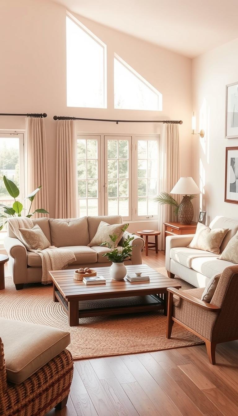
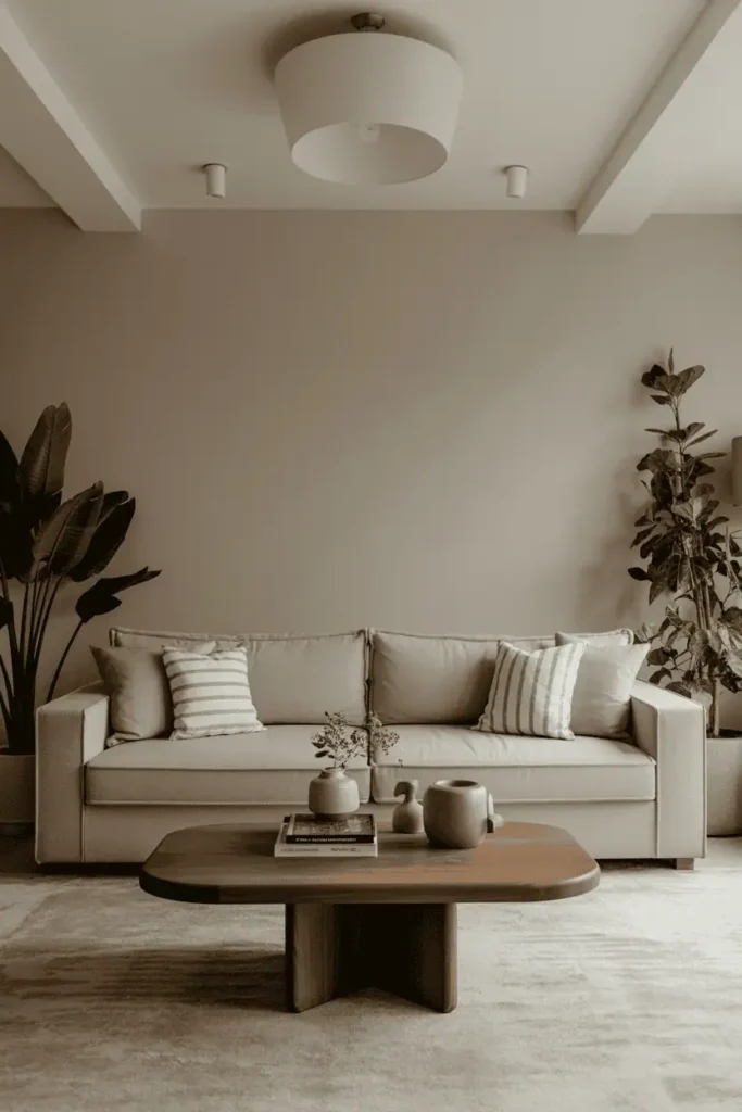
5. Earthy Neutral Living Room Designs
Using earth-inspired neutral tones in your living room is truly magical. These warm, grounding colors make your space feel connected to nature. They also add a touch of elegance. Earthy neutrals make any room feel like a peaceful retreat.
Earth-inspired home decor brings authentic warmth without being too much. These colors fit well in both modern and traditional designs. They offer great flexibility for any style.

Incorporating Mushroom and Taupe Tones
Mushroom and taupe colors are key to great earthy neutral designs. They add depth and sophistication. Imagine soft mushroom walls with rich taupe furniture – it’s like bringing the forest inside!
These colors are perfect as main or accent shades. Start with lighter mushroom tones on big surfaces. Then, add deeper taupes with furniture and textiles.
Adding Natural Stone and Wood Accents
Natural materials are absolutely essential for true earthy neutral design. I love adding travertine coffee tables, slate walls, and reclaimed wood shelves. These add real character to your space.
Choose materials with natural variations and imperfections. Nature doesn’t have perfect uniformity. Embrace the unique patterns and textures that make each piece special.
Creating Organic Flow with Earth Tones
To create seamless flow, vary the depth and warmth of your earth tones. Use lighter beiges for big pieces, medium taupes for furniture, and deeper browns for grounding elements.
This natural rhythm is calming and effortless. Add woven textures like jute rugs and linen curtains. Plants are key – they bring natural life to your space!
I’ve found that navy is a great neutral that adds elegance to any room! It’s a rich, sophisticated color that’s perfect for neutral color schemes. Navy is as versatile as traditional neutrals but adds depth and character.

Navy is an amazing neutral base because it goes well with many colors. I like to use navy on accent walls or big furniture pieces. It makes other colors stand out beautifully.
Think of navy as a regular neutral. Use it all over the room in different shades. This keeps the room looking cohesive and timeless.
Balancing Dark and Light Elements
Getting navy combinations right is all about balance! I follow the 60-30-10 rule. The room should have mostly light colors like cream walls or white furniture.
Here’s how I balance it:
- 60% light neutrals – whites, creams, soft grays
- 30% navy elements – furniture, textiles, accent walls
- 10% metallic accents – brass, gold, or warm metals
The way you style navy changes its look! Coastal navy schemes are fresh and relaxed with whites and natural textures. Think rope details, weathered wood, and sea glass.
Traditional navy looks more formal and elegant. I pair navy with rich creams, brass, and classic patterns. This works well in formal living rooms for a sophisticated look.
7. Texture and Pattern in Neutral Spaces
The magic of neutral living room design is in texture and pattern play. Without bold colors, texture brings depth and excitement. I find this part of neutral decor truly brings spaces to life!
Mixing Different Fabric Textures
I enjoy mixing fabric textures in neutral spaces for a tactile appeal. Imagine a smooth leather sofa with chunky knit throws. Or silky velvet pillows against rough jute rugs. This mix keeps your eye moving.
Varying texture scales and weights is key. Mix fine and coarse, smooth and rough, matte and shiny. Think linen curtains with wool blankets, or a sleek vase next to a woven basket.

Incorporating Subtle Patterns
Subtle patterns add movement and personality to your neutral living room. I choose tone-on-tone designs for interest without disrupting the calm. Cream-on-cream damask, soft gray geometric prints, or tiny botanical motifs work well.
Stripes, plaids, and simple geometrics are great in the same color family. They add rhythm without overwhelming your neutral decor.
Creating Visual Interest Without Color
Building visual drama needs careful layering and placement. I vary heights, shapes, and surfaces for dynamic rhythm.
Play with finishes for complexity. Mix matte paints with glossy ceramics, or brushed metals with polished stone. A rustic wood console with sleek metal frames adds contrast, making spaces feel rich and sophisticated.
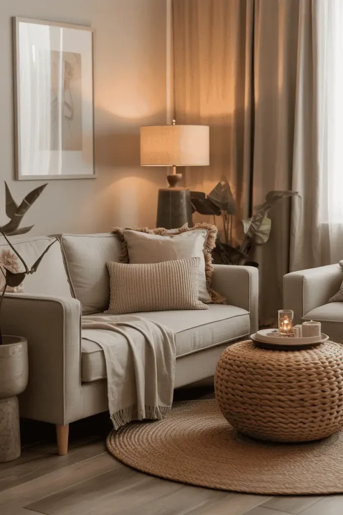
8. Lighting Considerations for Neutral Palettes
Lighting is key to making a neutral color scheme pop! I’ve worked with many homeowners and seen how the right lighting can transform a beige living room or gray living room. It brings out the beauty of neutral colors and creates a cozy atmosphere.
How Natural Light Affects Neutral Colors
Natural light changes how your neutral colors look throughout the day. It’s important to understand this to get it right! North-facing rooms get cooler, bluer light, which can make neutrals look dull. I suggest using warmer beige tones in these rooms to balance the light.
South-facing rooms are perfect for neutrals because they get warm, beautiful light. East and west-facing rooms are different, changing from morning to evening. Always test paint and fabric samples in various lights before deciding.

Choosing the Right Artificial Lighting
Choosing the right artificial lighting is just as important. I always recommend warm white LED bulbs (2700K-3000K) for their cozy feel. Cool white bulbs can make a room feel cold and unwelcoming.
Using multiple light sources at different heights is a great trick. I suggest overhead lights for general use, table lamps for reading, and accent lights for special features.
Creating Ambiance with Layered Lighting
Layered lighting can turn a simple room into a cozy, inviting space. I always include dimmable options to change the mood. Floor lamps with warm bulbs create cozy spots, while accent lights highlight interesting details.
Candles are my secret weapon for adding warmth and romance. They create a beautiful, flickering light that enhances neutral colors. The goal is to have a lighting plan that supports your color scheme and mood.
9. Furniture Selection for Neutral Color Schemes
Furniture choices can really change the feel of a room. I love helping homeowners find the right neutral furniture for a timeless look. It’s all about picking pieces that fit your color scheme and can grow with your style.

Choosing Upholstery Colors and Materials
I’m a big fan of neutral furniture in classic colors like cream, gray, and taupe. These colors are great with any accent colors you might add. I also think about how fabrics will look over time.
Linen and cotton are my top picks because they get better with age. Performance fabrics are great for families because they stay looking good. Leather is also a favorite because it gets even more beautiful as it ages.
Wood Tones That Work with Neutrals
Wood tones add warmth and texture to any neutral home decor setup. Light oak and ash give a fresh Scandinavian feel. Walnut and mahogany add a sophisticated touch.
It’s all about matching wood tones to your neutral colors. Warm neutrals go well with honey oak or cherry. Cool neutrals look great with gray-washed or ebony. Mixing different wood tones can add interest, as long as they’re in the same warmth family.
Metal Accents and Hardware Choices
Metal finishes are like jewelry for your neutral home decor! Brushed brass warms up beige and cream. Brushed nickel or black iron work well with gray.
Being consistent is key. I pick one metal finish and use it everywhere. This creates a cohesive, polished look that feels intentional and sophisticated!
Creating Your Perfect Neutral Haven
I’m excited you’ve discovered the incredible versatility of neutral palettes! These timeless living room ideas show that neutral interior design makes spaces sophisticated and welcoming.
Your neutral living room journey begins with choosing a palette that speaks to your heart. Whether you prefer warm beiges, cool grays, or greige, each offers endless possibilities for personal expression.
I love how neutral backgrounds let you showcase meaningful artwork, treasured family photos, and unique accessories. Layering different textures, like chunky knit throws and smooth leather chairs, adds depth without overwhelming your space.
Lighting is key. Natural light highlights subtle undertones, while chosen lamps create the perfect evening ambiance. Your furniture selections tie everything together beautifully.
The magic happens when you embrace the process. Start small with paint samples, test different combinations, and trust your instincts. These neutral interior design principles adapt as your style evolves, making them truly investment-worthy choices.
Your living room should reflect who you are while providing that peaceful retreat everyone craves. With these neutral palettes as your canvas, you’re ready to create a space that feels authentically you – timeless, comfortable, and absolutely beautiful.
To bring you cozy inspiration more efficiently, we sometimes use AI to assist in content creation — but every word and idea is carefully shaped by our team. See our AI Disclosure for more info.