This post may contain affiliate links. If you click and buy, we may earn a small commission at no extra cost to you. Learn more.
A wooden frame does something quiet but important on a wall. It draws the eye without shouting, softens the edge of whatever’s inside it, and carries a warmth that metal or acrylic rarely can. Even a mismatched collection of wooden frames — different tones, different widths, different finishes — can feel unified simply because they share that same material honesty.
The appeal isn’t about uniformity or trend. It’s about how wood ages, how it accepts nicks and scratches without looking damaged, and how it relates naturally to other elements in the room: furniture, shelving, doorways, floor trim. A few wooden frames on a wall can make a space feel more settled, even if everything else is fairly new.
What makes wooden frames versatile is their ability to shift in feeling depending on what surrounds them. A dark walnut frame can feel formal or rustic, modern or vintage, depending on the art inside and the wall color behind. A pale oak frame can disappear into a minimal room or anchor a busier gallery wall.
The goal isn’t to fill every wall or make a statement. It’s to use frames thoughtfully — as quiet anchors that hold images, prints, or objects while adding a layer of texture and age that painted walls alone can’t provide.
What you’ll find here:
Visual inspiration rooted in real homes
Practical ideas you can apply gradually
Furniture and decor concepts that support browsing and shopping
Looks that work across room sizes and styles
Contents
- 1 1. A Single Large Wooden Frame Above the Sofa
- 2 2. Mismatched Wooden Frames in a Loose Grid
- 3 3. A Wooden Frame Leaning on a Mantel or Console
- 4 4. Matching Wooden Frame Pair for Symmetry
- 5 5. A Wooden Frame with a Botanical Print
- 6 6. Dark Wood Frames on Light Walls
- 7 7. Light Oak Frames in a Scandinavian Space
- 8 8. Reclaimed Wood Frames for Rustic Spaces
- 9 9. Floating Wooden Ledges with Framed Art
- 10 10. Handmade Wooden Frames with Visible Joinery
- 11 Styling Tips to Pull the Look Together
- 12 Conclusion
1. A Single Large Wooden Frame Above the Sofa
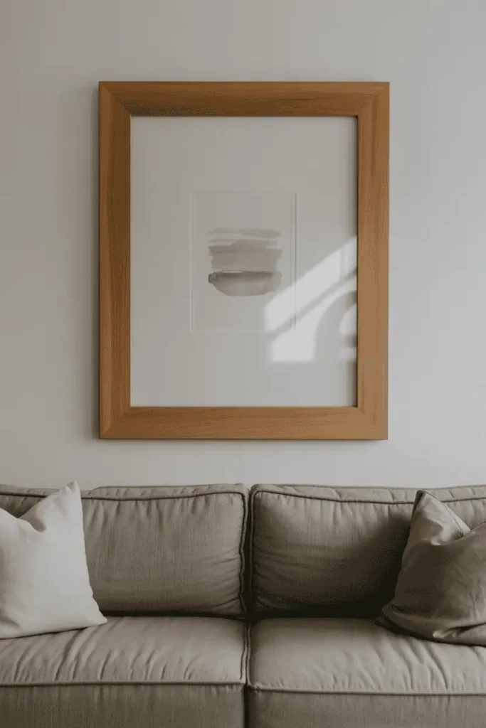
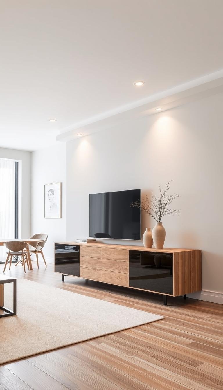
One oversized wooden frame centered above a sofa can ground an entire living room wall without needing a full gallery arrangement. The scale matters here — large enough to balance the horizontal line of the sofa, but not so massive that it overwhelms the room. Emotionally, it reads as intentional and calm, like the room has been considered rather than assembled quickly.
Practical guidance
This works best when the frame is about two-thirds the width of the sofa, give or take. Too narrow and it floats awkwardly; too wide and it competes with the furniture below. Hang it so the center sits roughly at eye level when you’re seated, not standing. It tends to fail if the art inside is too busy or bright — let the wood do some of the visual work.
Styling & product direction
Look for frames in walnut, oak, or ash with visible grain and simple profiles. Pair with low-slung sofas, neutral upholstery, and a few soft pillows. A simple side table or floor lamp nearby continues the warm wood thread without making the space feel too matched.
Design tip: If the sofa is dark, choose a lighter wood frame to create contrast. If the sofa is light, a darker frame adds weight without feeling heavy.
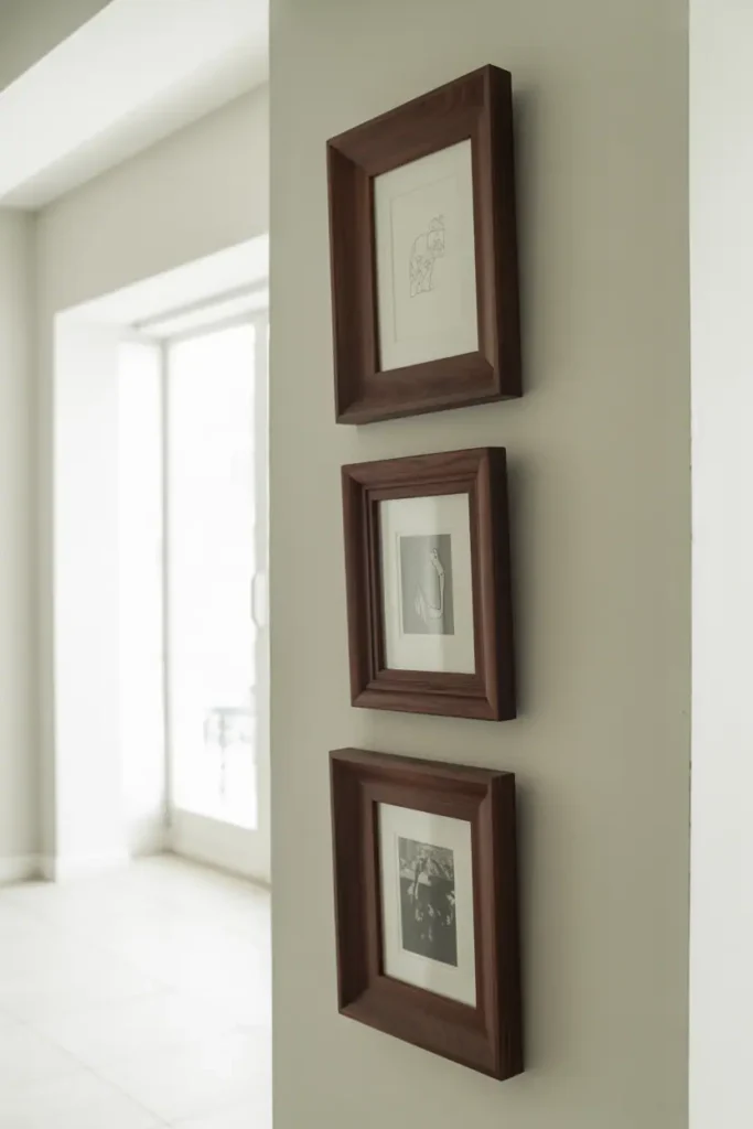
2. Mismatched Wooden Frames in a Loose Grid
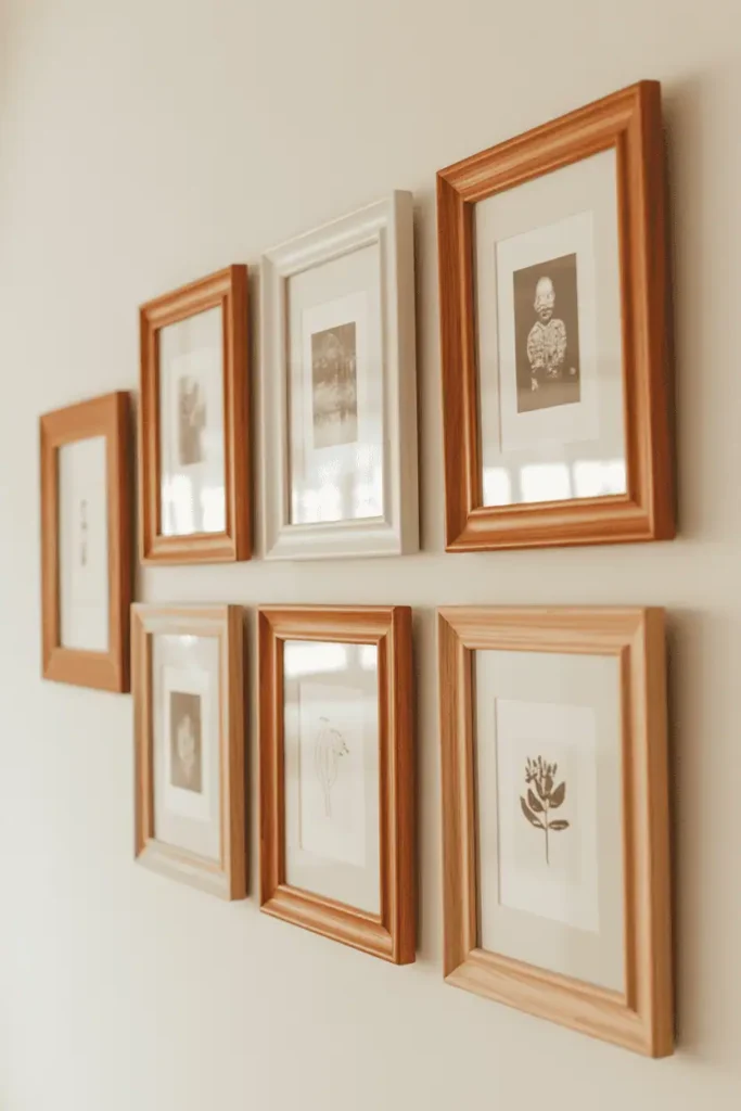
A collection of wooden frames in different sizes and tones arranged in a loose grid feels collected rather than purchased all at once. The variation in wood — some light oak, some cherry, maybe a piece of reclaimed barn wood — keeps the eye moving without chaos. Visually, it suggests the wall has grown over time.
Practical guidance
This works best when you start with one anchor piece and build around it. Keep the spacing between frames consistent, even if the frames themselves vary. It tends to fail if the wood tones are too scattered — stick to warm tones or cool tones, not both. Use picture hanging strips or a measuring template to avoid a wall full of holes.
Styling & product direction
Pair with a mix of vintage prints, black-and-white photos, pressed botanicals, and simple line drawings. Neutral furniture, wood shelving, and soft textiles nearby help the gallery wall feel part of the room rather than a separate display.
3. A Wooden Frame Leaning on a Mantel or Console
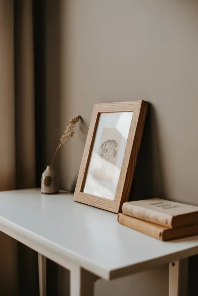
Instead of hanging every frame, let one or two lean casually on a mantel, console, or shelf. The angle is relaxed, and the composition becomes easy to adjust when you want to swap the art or add a vase or candle. Emotionally, it feels less permanent and more lived-in.
Practical guidance
This works best with medium to large frames — small ones get lost on a shelf. Keep the depth of the shelf in mind; the frame needs enough support to lean without tipping. It tends to fail if the shelf is crowded with too many objects competing for space. Leave room on either side.
Styling & product direction
Look for thicker wooden frames with substantial edges so they stand securely. Layer with ceramic vases, small potted plants, stacked books, or a tray. Simple lamps or candles nearby add warmth without clutter.
Style note: Lean the frame slightly off-center rather than perfectly centered. The asymmetry feels more natural.
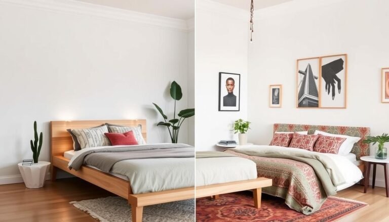
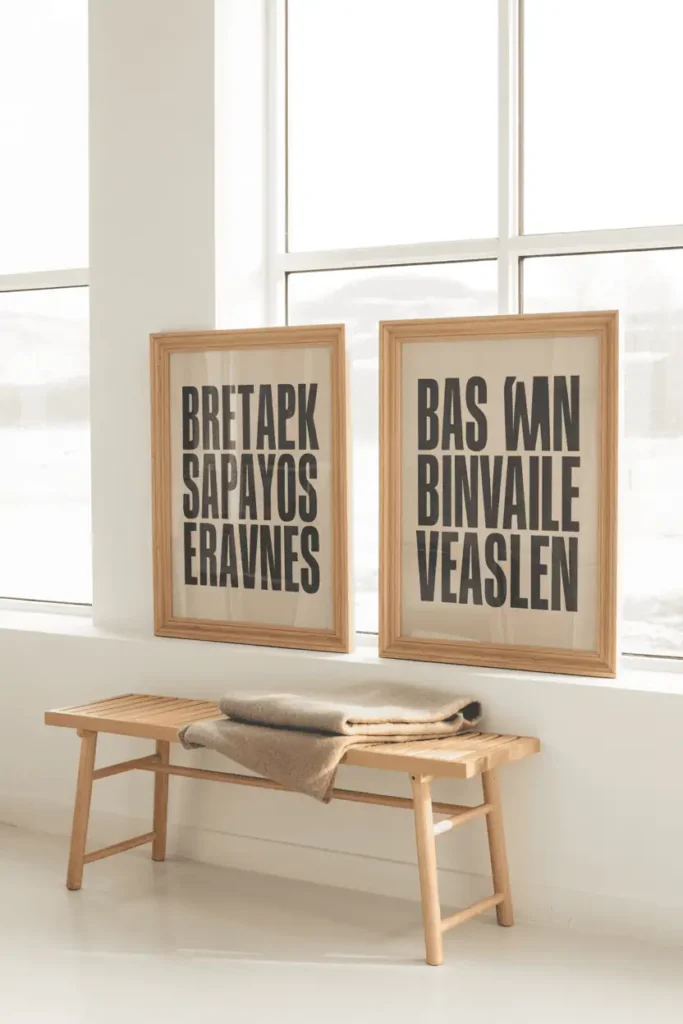
4. Matching Wooden Frame Pair for Symmetry
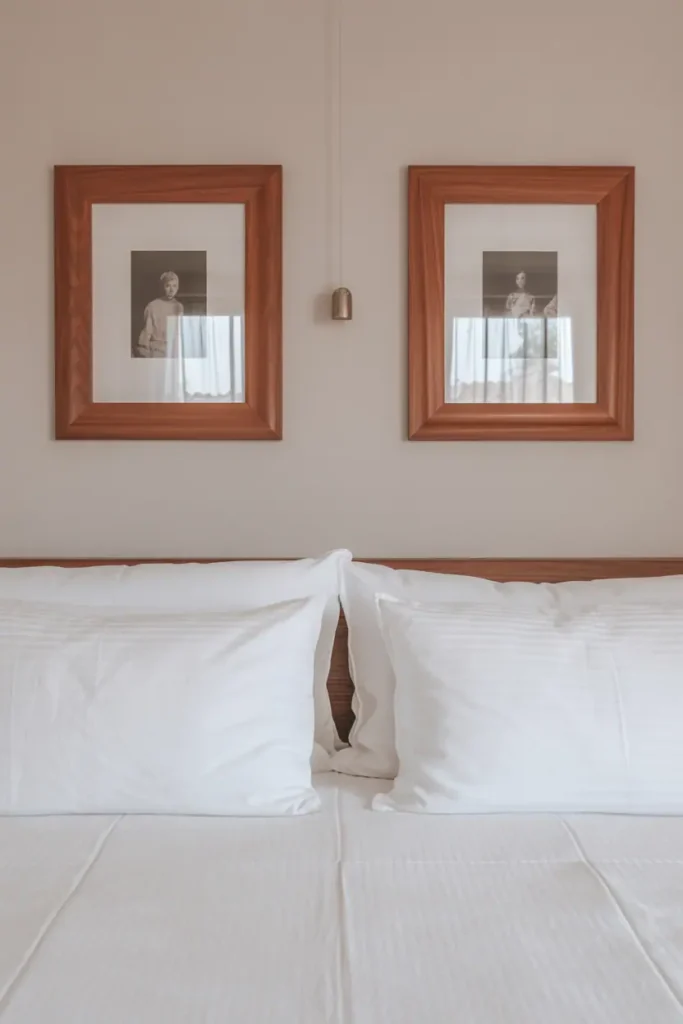
Two identical wooden frames flanking a bed, a sofa, or a doorway create a sense of order without rigidity. The matching frames provide visual balance, while the wood itself keeps the symmetry from feeling too formal. It’s a quieter approach than a full gallery wall but still anchors the space.
Practical guidance
This works best when the frames are hung at the same height and spaced evenly. Measure carefully — even a small difference in placement reads as accidental rather than intentional. It tends to fail if the art inside the frames clashes in tone or subject; keep them visually related.
Styling & product direction
Choose simple wooden frames in oak, walnut, or painted wood with minimal detailing. Pair with upholstered headboards, clean-lined furniture, and soft bedding or throw pillows. A centered pendant light or sconce between the frames reinforces the symmetry.
By now, the walls should feel less like blank surfaces waiting to be filled and more like thoughtful backdrops that hold meaning without demanding attention.
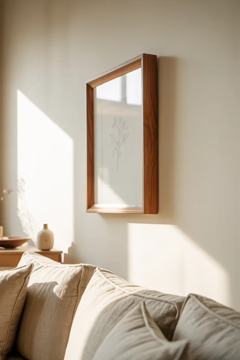
5. A Wooden Frame with a Botanical Print
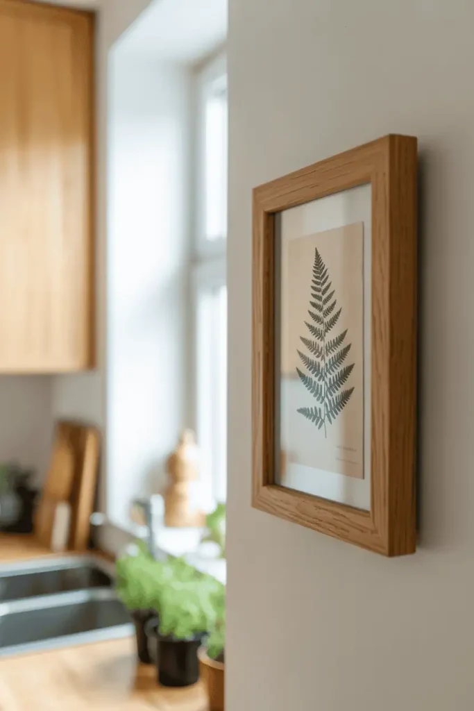
A single wooden frame holding a pressed botanical or simple plant illustration feels grounded and timeless. The natural subject pairs quietly with the natural material, and the result is understated but warm. It works in kitchens, bedrooms, entryways, or bathrooms — anywhere you want a bit of softness.
This idea doesn’t need much elaboration. Find a simple print, choose a light or medium wood frame with clean lines, and hang it where morning light can hit it gently. Avoid ornate frames here; the botanical does better with restraint.
6. Dark Wood Frames on Light Walls
Dark walnut or espresso frames on pale walls create strong, clean contrast without harshness. The darkness of the wood reads as grounding, almost anchoring the wall visually. Emotionally, it feels sophisticated but not cold.
Practical guidance
This works best in rooms with good natural light — dark frames on light walls can feel heavy in dim spaces. Keep the art inside simple: black-and-white photography, line drawings, or muted watercolors. It tends to fail if the frames are too ornate; stick with clean profiles and minimal detailing.
Styling & product direction
Pair with light-colored sofas, simple wood furniture in lighter tones, and soft rugs. Avoid heavy drapes or dark accent walls that compete with the frames for visual weight.
Pale oak or ash frames disappear softly into minimalist or Scandinavian-inspired rooms. They provide structure without adding heaviness, and they echo the light wood furniture common in those spaces. The frames support the aesthetic rather than fighting it.
Practical guidance
This works best when the wall color is white, off-white, or soft gray. The light frame needs contrast from the art inside — think bold black type, muted photography, or simple line art. It tends to fail if everything is too light and washed out; the frame gets lost entirely.
Styling & product direction
Look for frames with simple, flat profiles and light natural finishes. Pair with birch or beech furniture, linen textiles, wool rugs, and ceramic accents. Keep the overall palette neutral with occasional pops of muted color.
Design tip: If the frame feels too invisible, mat the art in a soft gray or cream to create subtle separation.
8. Reclaimed Wood Frames for Rustic Spaces
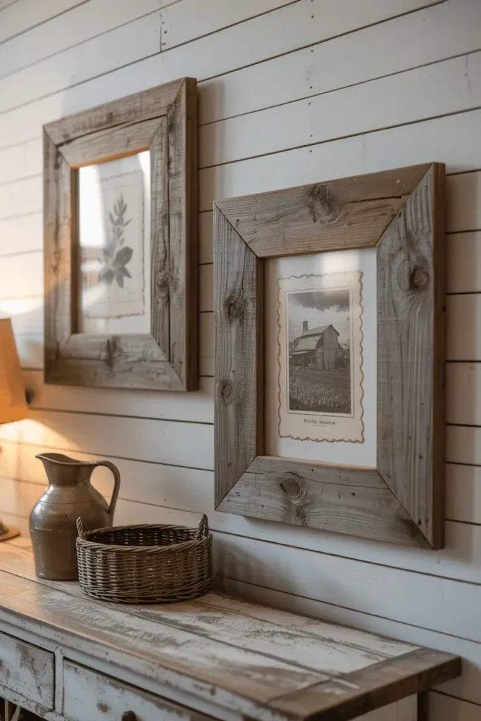
Frames made from reclaimed barn wood or weathered timber bring a rough, aged quality that fits naturally into rustic or farmhouse-style rooms. The visible grain, knots, and color variation give each frame character. Emotionally, they feel handmade and intentional.
Practical guidance
This works best when the rest of the room has some rustic elements already — exposed beams, wood furniture, or vintage textiles. It tends to fail if the frame is too rough or heavy for the art inside; balance a chunky frame with a simple, clean image.
Styling & product direction
Pair with distressed wood furniture, woven baskets, linen or burlap textiles, and vintage-style lighting. Keep the color palette earthy: tans, browns, grays, and muted greens.
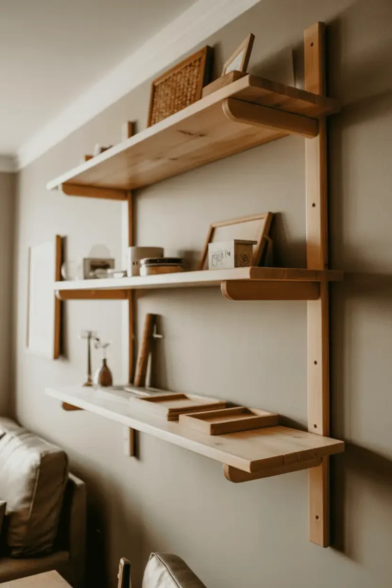
9. Floating Wooden Ledges with Framed Art
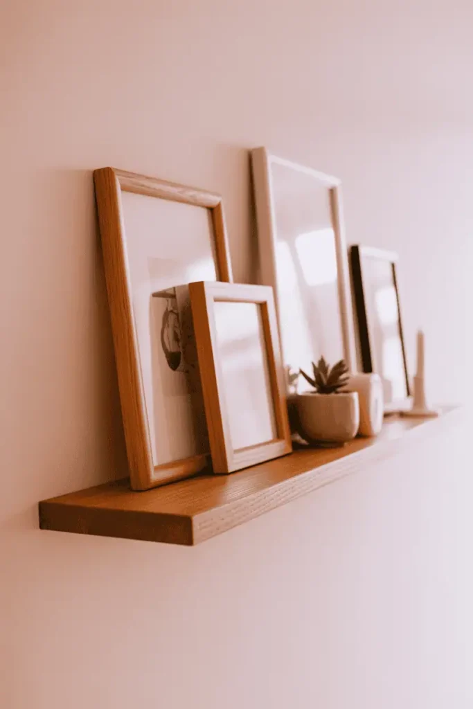
Instead of hanging frames individually, use a wooden ledge to hold several framed pieces that can lean and layer. The frames can be easily swapped, adjusted, or rearranged without new holes in the wall. Visually, it creates a collected, flexible gallery that feels less permanent.
Practical guidance
This works best with ledges deep enough to support frames securely — at least four inches. Keep the frames varied in size but similar in tone so they relate visually. It tends to fail if the ledge is too cluttered or if frames are stacked too many layers deep.
Styling & product direction
Look for simple wood ledges in oak, walnut, or painted finishes. Add small potted plants, candles, or books between the frames to break up the repetition. Pair with neutral walls and soft textiles nearby.
At this point, the room should feel less like a space with “art on the walls” and more like a place where images, objects, and materials are quietly conversing.
10. Handmade Wooden Frames with Visible Joinery
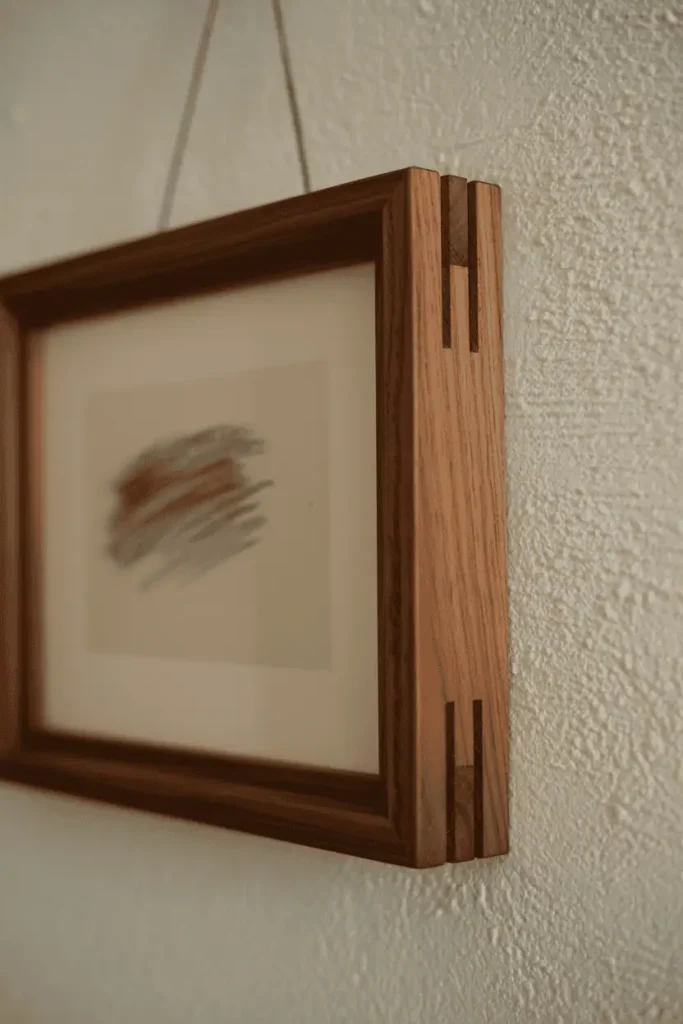
Frames with visible corner joinery — dovetails, miters, or finger joints — add a layer of craft and intentionality. The joinery becomes part of the design rather than hidden, and it signals that the frame was made with care. Emotionally, it feels personal and thoughtful.
Practical guidance
This works best when the frame isn’t competing with overly busy art. Let the craftsmanship be part of the story. It tends to fail if the joinery is rough or misaligned; quality matters here.
Styling & product direction
Pair with simple furniture, natural textiles, and understated decor. These frames work well in bedrooms, home offices, or reading nooks where craft and intention are already part of the room’s character.
Styling Tips to Pull the Look Together
- Use warm-toned lighting to bring out the richness of wood grain in frames.
- Repeat wood tones across the room — in furniture, shelving, or trim — to create visual cohesion.
- Leave some wall space empty so framed art can breathe and the eye can rest.
- Vary frame sizes but keep wood tones within the same temperature family (all warm or all cool).
- Avoid mixing glossy finishes with matte wood; the contrast feels jarring.
- Mat lighter prints in neutral tones to separate them gently from the frame.
- Keep hardware minimal and hidden when possible so the frame, not the mounting, is what you notice.
Conclusion
Start with one or two wooden frames in rooms where you spend the most time. Let them settle in before deciding where the next one goes. Frames don’t need to match, but they do need to relate — through tone, finish, or simply the fact that they’re all made of wood.
The most successful framed walls aren’t the ones that were hung in a single afternoon. They’re the ones that grew slowly, adjusted over time, and still feel like they could shift again without breaking the room’s rhythm.
Save what feels close to the way you already live. Come back when you’re ready to add more. There’s no rush, and the wall will still be there.
To bring you cozy inspiration more efficiently, we sometimes use AI to assist in content creation — but every word and idea is carefully shaped by our team. See our AI Disclosure for more info.