
This post may contain affiliate links. If you click and buy, we may earn a small commission at no extra cost to you. Learn more.
You’ve pinned a hundred earthy living rooms. Cream sofas on terracotta rugs. Wood shelves against sage walls. That feeling when everything just breathes together.
But here’s where it gets tricky: which wood tone goes with which wall color? Does walnut work with olive green? Can you mix three different wood finishes without the room looking confused? This guide answers exactly that — the color palettes that make earthy decor work, and the wood tones that anchor them. No guesswork. Just the combinations that deliver that calm, grounded vibe you’ve been chasing.
Contents
- 1 1. The Foundation: What Makes a Palette “Earthy”
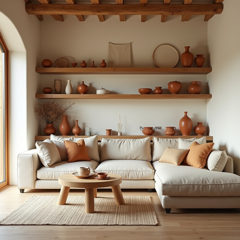
- 2 2. Palette One: Cream, Terracotta, and Honey Oak
- 3 3. Palette Two: Sage, Cream, and Medium Walnut
- 4 4. Palette Three: Charcoal, Sand, and Ebonized Wood
- 5 5. Palette Four: Ochre, Cream, and Reclaimed Barn Wood
- 6 6. Palette Five: Olive, Warm White, and Light Ash Wood
- 7 7. The Wood Tone Mistake Everyone Makes
- 8 8. Palette Six: Rust, Cream, and Cherry Wood
- 9 9. Palette Seven: Dusty Blue, Sand, and Driftwood Gray
- 10 10. How to Test Your Palette Before Committing
- 11 11. The Rule of Three for Styling Wooden Accents
- 12 12. When to Choose Warm Wood vs. Cool Wood
- 13 13. The Power of One Statement Wood Piece
- 14 14. Palette Eight: Greige, Camel, and White Oak
- 15 15. The Final Layer: Bringing It All Together
1. The Foundation: What Makes a Palette “Earthy”
Earthy isn’t beige everything — it’s nature’s actual color wheel brought indoors.
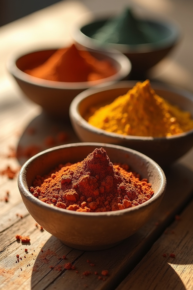
Think clay, sand, moss, stone, bark. These aren’t trend colors. They’re the tones humans have built homes around for centuries, which is why they feel so right when you walk into a room. The key is balancing warm and cool within the earth spectrum. Too much warm (all terracotta and rust) feels heavy. Too much cool (all sage and slate) feels sterile. The magic happens in the mix.
- Warm earthy: terracotta, burnt sienna, camel, ochre, rust
- Cool earthy: sage, olive, slate gray, dusty blue, charcoal
- Neutral anchors: cream, sand, warm white, greige
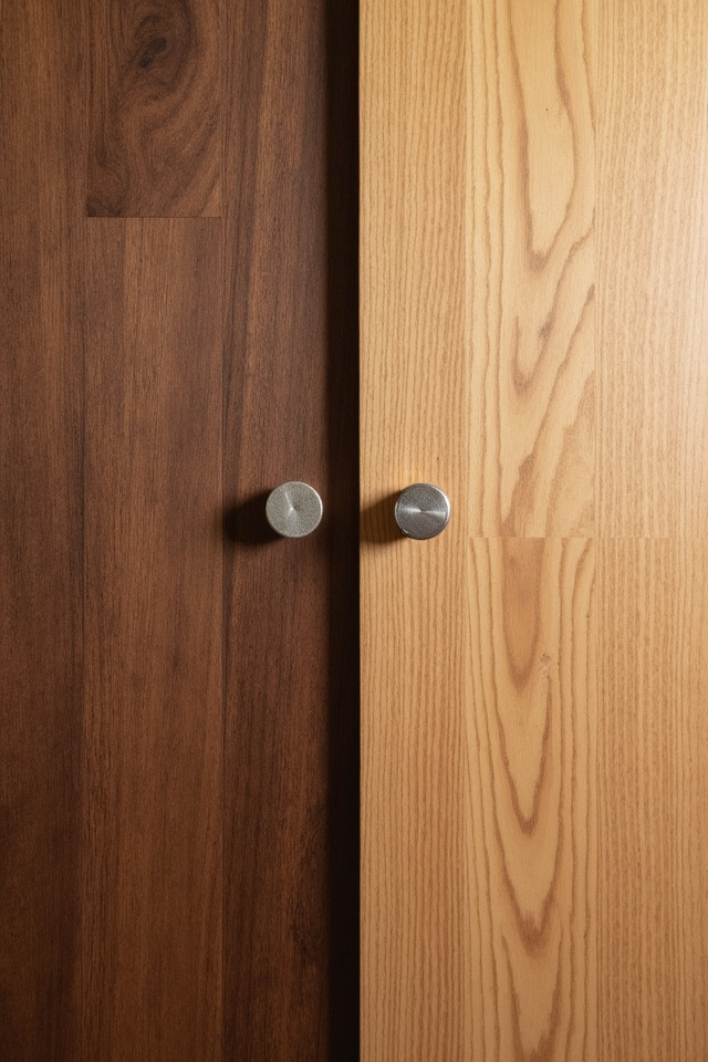
Your wood choices shift depending on which end of that spectrum you lean toward. Warm palettes want honey-toned or medium woods. Cool palettes need darker, grayer woods to keep the balance.
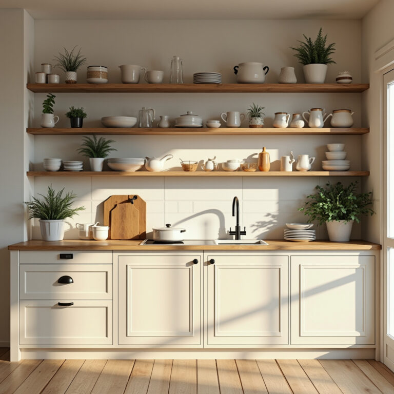
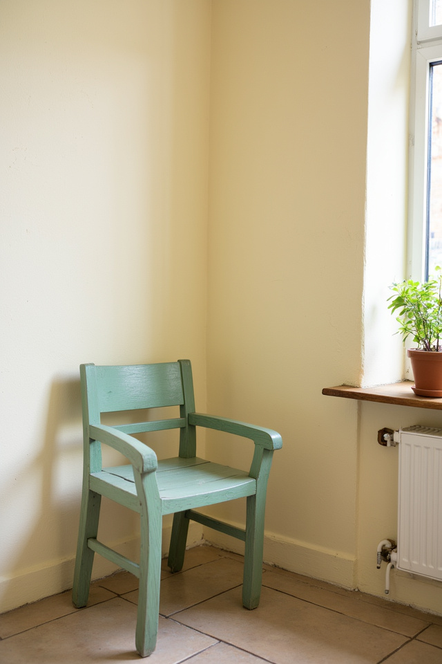
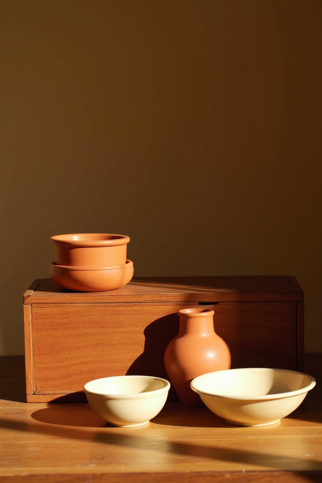
2. Palette One: Cream, Terracotta, and Honey Oak
This is the warm embrace palette — the one that makes every room feel like late afternoon sun.
The formula: SW Accessible Beige or BM White Dove on the walls, terracotta accents in textiles, and honey oak or light walnut wood tones throughout. It’s Mediterranean villa meets California casual. The cream walls let the terracotta pop without fighting for attention, and the honey oak bridges both — warm enough to support the clay tones, light enough to keep the space airy.
Best Wood Tones for This Palette
- White oak with natural finish
- Light walnut (not too dark)
- Maple with honey stain
- Ash or pine with warm undertones
This palette loves texture. Woven baskets, linen curtains, ceramic vases in cream or rust. Look for round wooden trays or dough bowls in light oak on Amazon — the $30-50 range gives you solid wood that ages beautifully, and they work as centerpieces or styling bases on open shelves.
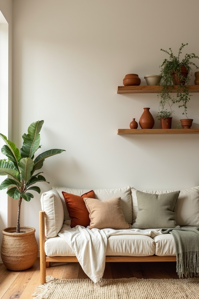
3. Palette Two: Sage, Cream, and Medium Walnut
The balanced palette — this is where rustic farmhouse meets organic modern.
Paint one accent wall in SW Clary Sage or BM October Mist. Keep the other walls cream or warm white. Then bring in medium-toned walnut furniture and decor. The sage provides that grounded, botanical calm, the cream softens it so it never feels cold, and the walnut adds just enough weight to anchor the whole room. This combination photographs beautifully — it’s why you see it all over Pinterest saved under “dream living room” boards.
- Sage works on walls, throw pillows, or pottery
- Cream in large textiles: sofa, curtains, area rug
- Walnut in floating shelves, picture frames, side tables
Why Medium Walnut Specifically
Too light and it disappears against cream. Too dark and it competes with the sage instead of supporting it. Medium walnut — that rich brown with slight red undertones — sits perfectly between the two. It reads warm without overpowering the cooler sage tones.
Walnut wooden trays and serving boards are everywhere on Amazon right now, usually $25-40 for quality pieces. Style one on your coffee table with a cream candle and a small plant. Instant earthy layering.
4. Palette Three: Charcoal, Sand, and Ebonized Wood
The moody earthy palette — for when you want drama without losing the natural vibe.
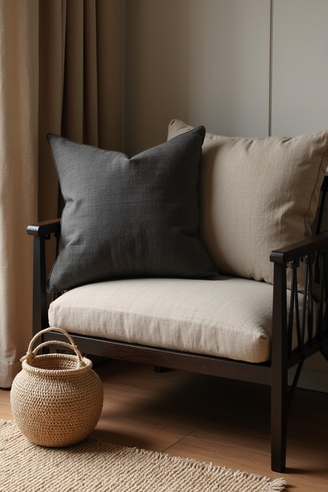
This leans masculine-modern but stays grounded through material choice. Charcoal gray walls (try SW Cityscape or BM Kendall Charcoal), sand-colored textiles, and dark ebonized or blackened wood finishes. The contrast is intentional. The darkness makes the natural textures — linen, wool, raw ceramics — stand out even more.
- Charcoal on one or two walls, never all four
- Sand in sofa upholstery, throws, pillows
- Ebonized oak or black-stained wood in shelving and frames
This palette needs light. If your room doesn’t get strong natural light, skip this one or use charcoal only as an accent. In the right space, though, it’s stunning. Pair it with matte black metal accents and plenty of plants — the green pops like crazy against charcoal.
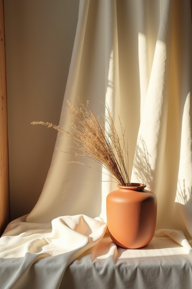
5. Palette Four: Ochre, Cream, and Reclaimed Barn Wood
The rustic warmth palette — this is farmhouse done right, no twee signs required.
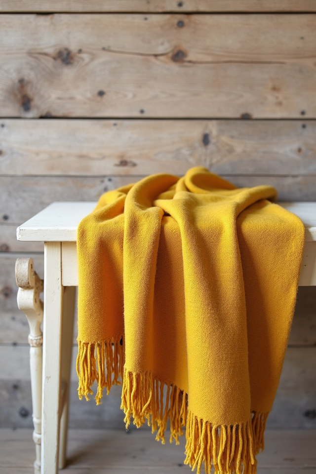
Ochre is that golden-mustard tone that feels both retro and timeless. Use it sparingly: throw pillows, one piece of wall art, maybe a woven pouf. Keep walls cream (BM Swiss Coffee is perfect here). Then bring in reclaimed barn wood with that weathered, silvery-gray patina. The aged wood keeps the ochre from feeling too saturated or trendy. It grounds the warmth.
Where to Use Reclaimed Wood in This Palette
- Floating shelves in the living room or kitchen
- A large wooden framed mirror
- Picture ledges in a gallery wall setup
- Coffee table or bench with visible grain and texture
Reclaimed wood pieces are everywhere on Amazon now — floating shelf sets run $40-70 depending on length, and they arrive ready to mount. The beauty is in the imperfection: knots, nail holes, color variation. That’s what makes the ochre accents feel curated instead of matchy.
You May Also Like
6. Palette Five: Olive, Warm White, and Light Ash Wood
The Scandinavian-earthy hybrid — where minimalism meets warmth.
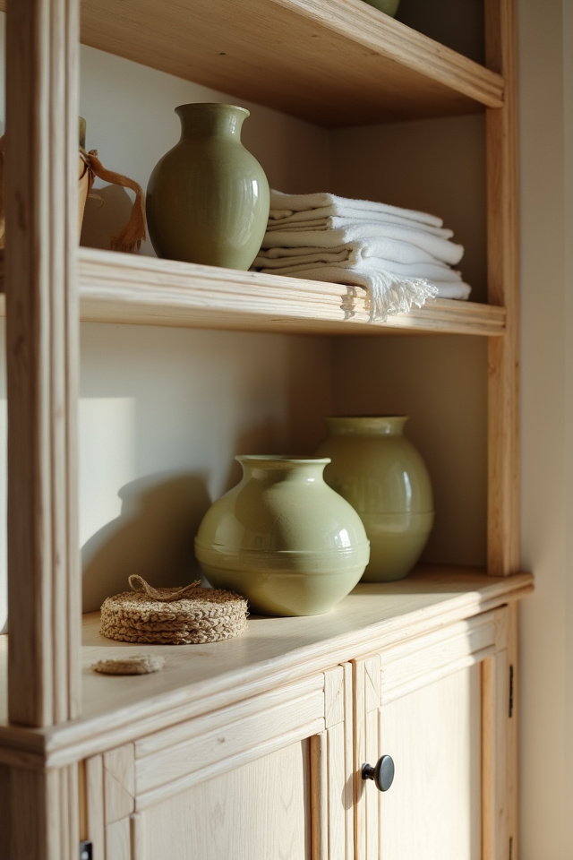
Olive green is softer than sage, more muted than moss. It’s the green that works in any light. Paint it on kitchen cabinets, use it in curtains, or bring it in through pottery and textiles. Keep walls warm white — not stark, not cream, but that in-between like SW Alabaster. Then anchor it with light ash wood. Ash has a pale, almost blonde tone with subtle grain. It’s the opposite of heavy.
- Olive in smaller doses: cabinets, one accent wall, textiles
- Warm white as the dominant wall color
- Light ash wood in furniture legs, shelving, picture frames
This palette loves natural light and open space. It’s the one for people who want earthy but can’t do rustic. The vibe is airy, clean, but never cold. Add linen, cotton, and ceramic in cream or white. A light ash wooden tray on your nightstand or dresser pulls the whole look together — look for Scandinavian-style trays on Amazon, usually $18-35, with those clean edges and minimal design.
7. The Wood Tone Mistake Everyone Makes
Matching every wood finish in the room.
It sounds like it should work — everything walnut, or everything oak. But rooms with one wood tone feel flat. They lack the layering that makes earthy spaces interesting. The trick is mixing wood tones within the same temperature family. If you have medium walnut shelves, you can add a lighter oak side table and a darker walnut picture frame. They’re all warm-toned, so they harmonize, but the variation adds depth.
The Mixing Formula
- Pick a dominant wood tone (this is your large furniture piece)
- Add one lighter tone for contrast
- Add one darker tone for grounding
- Keep them all in the same warm or cool family
Example: medium walnut floating shelves (dominant), light oak tray on the shelf (lighter contrast), dark walnut frame on the wall (grounding). All warm-toned. All working together without matching.
8. Palette Six: Rust, Cream, and Cherry Wood
The richest of the earthy palettes — this one feels collected over time.
Rust is deeper than terracotta, more saturated. It’s bold without being loud. Use it in a single throw blanket, in artwork, or in one statement piece like a ceramic vase. Pair it with cream walls and textiles. Then bring in cherry wood — that reddish-brown tone that feels warm and slightly formal. Cherry wood elevates rust instead of competing with it. The red undertones connect.
Cherry wood picture frames, small side tables, or decorative bowls work beautifully here. Amazon carries cherry wood serving trays and wall-mounted shelves in the $30-60 range that add instant polish. This palette doesn’t need much — a few well-chosen pieces do all the work.
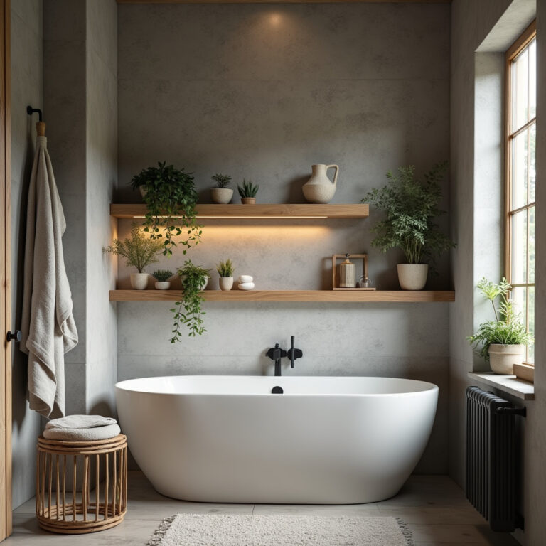
9. Palette Seven: Dusty Blue, Sand, and Driftwood Gray
The coastal earthy palette — where beachy meets grounded.
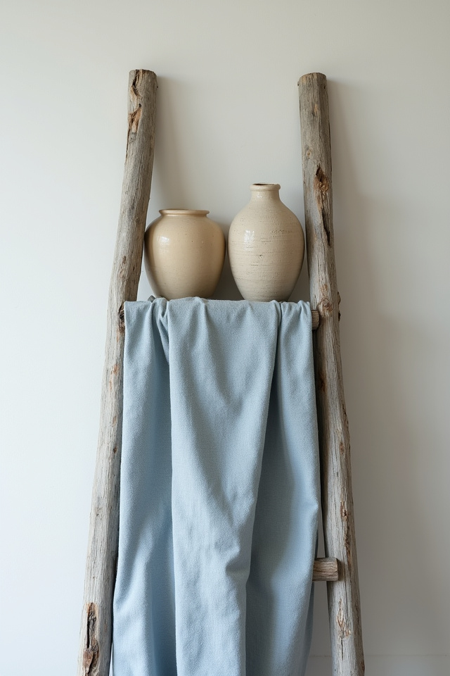
Dusty blue is that muted, almost-gray blue that reads more neutral than color. It’s cooler than sage but softer than slate. Use it on one accent wall or in bedding and pillows. Keep the rest sand and cream. Then bring in driftwood-gray wood tones — pieces that look sun-bleached and weathered. The combination feels like a calm, airy retreat without any nautical clichés.
- Dusty blue as the accent color, not the dominant one
- Sand in large textiles: rug, curtains, upholstery
- Driftwood gray in wooden bowls, frames, shelving
Best For
Bedrooms, bathrooms, any space where you want that immediate sense of calm. This palette rarely fails. It’s forgiving with different lighting and works in small or large rooms. Driftwood-style wooden trays and wall shelves are easy to find on Amazon — look for whitewashed or gray-stained finishes, typically $20-45.
10. How to Test Your Palette Before Committing
Paint swatches are free. Use them.
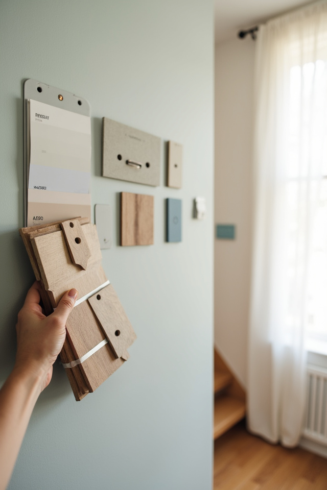
Grab samples of your top two wall colors. Paint large squares on poster board — not directly on the wall yet. Move those boards around the room throughout the day. Check them in morning light, afternoon light, evening light with lamps on. Colors shift dramatically depending on the light source, and what looks perfect at noon might feel wrong at 7 p.m.
Do the same with wood samples if you’re buying furniture. Bring a small wooden tray or cutting board in the finish you’re considering. Place it next to your paint samples. Does the wood look too red? Too yellow? Too dark? You’ll know immediately if it works or fights.
- Test in all lighting conditions before painting a full wall
- Hold wood samples next to your chosen paint colors
- Take photos — they reveal color clashes your eye might miss in person
11. The Rule of Three for Styling Wooden Accents
One wooden piece on a surface looks lonely. Two looks symmetrical and stiff. Three creates visual balance.
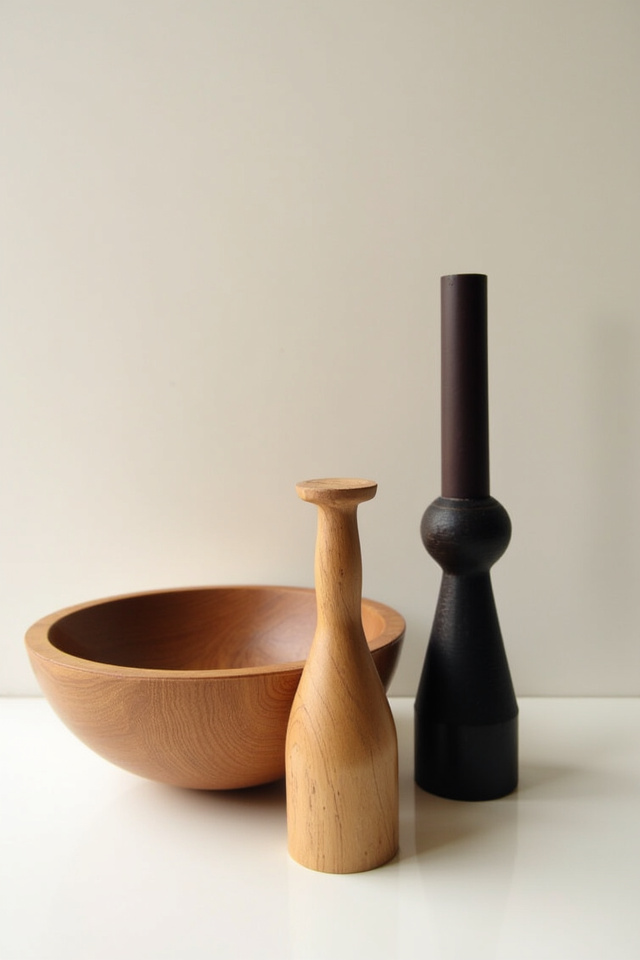
Whether it’s a shelf, a coffee table, or a console, style in groups of three. A wooden tray with a candle and a small plant. A wooden bowl with a stack of books and a ceramic object. The rule works because odd numbers feel more natural and less staged. One of the three should be wood, the other two can be different materials.
Styling Formula
- One wood element (tray, bowl, frame)
- One organic element (plant, dried stems, natural fiber object)
- One functional or decorative piece (candle, book, ceramic vase)
This works on open shelving, mantels, nightstands, kitchen islands. The wooden piece anchors the grouping, and the mix of textures keeps it interesting. Wooden dough bowls are perfect for this — they hold styling objects without looking cluttered. Find them on Amazon in walnut, mango wood, or acacia, usually $25-50 depending on size.
12. When to Choose Warm Wood vs. Cool Wood
Your wall color decides this for you.
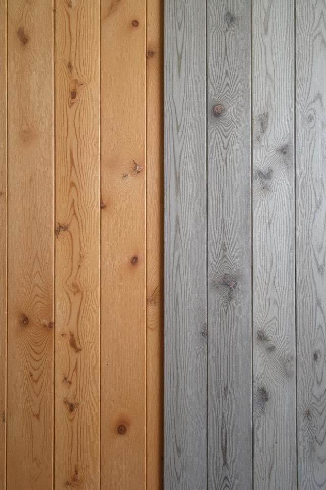
Warm walls — anything with yellow, orange, or red undertones like Accessible Beige, Kilim Beige, or Shaker Beige — need warm wood. Oak, walnut, cherry, honey-stained finishes. Cool walls — grays, blues, greens, or stark whites — need cooler woods. Ash, maple, whitewashed oak, or gray-stained finishes. When you match the temperature of wood to walls, everything settles into place. When you mismatch, the room feels disjointed even if you can’t pinpoint why.
If you’re unsure of your wall’s undertone, compare it to pure white. If it looks yellowish or peachy next to white, it’s warm. If it looks slightly blue or green, it’s cool.
You May Also Like
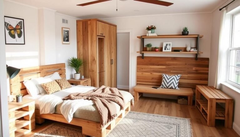
13. The Power of One Statement Wood Piece
You don’t need wooden everything — you need one piece that makes people stop.
A live-edge coffee table. A chunky floating shelf. A large wooden mirror frame. A sculptural wooden bowl. One bold wood piece does more for a room than ten small accents. It becomes the anchor. Everything else can be simple: cream textiles, neutral walls, minimal decor. The statement wood piece carries the weight.
Look for pieces with visible grain, natural edges, or interesting shapes. A large wooden bowl on a kitchen island, for example, pulls the entire space together even if the rest of the room is understated. Mango wood and acacia bowls with raw edges are trending on Amazon right now — $35-70 depending on size, and they’re substantial enough to feel like investment pieces.
14. Palette Eight: Greige, Camel, and White Oak
The safe-but-never-boring palette — this is earthy minimalism.
Greige — that perfect gray-beige hybrid — is the most versatile neutral in earthy design. Use it on all walls (SW Repose Gray or BM Revere Pewter). Add camel tones in leather, suede, or linen. Then bring in white oak with a natural or matte finish. The palette is quiet, but the textures make it rich. White oak has a subtle grain that adds warmth without demanding attention.
- Greige as the base wall color
- Camel in a leather chair, throw pillows, or woven rug
- White oak in shelving, picture frames, or side tables
This palette works in any room, any size, any lighting. It’s the one for people who want earthy style without bold color commitments. Layer in plants, woven baskets, and ceramic vases to keep it from feeling too minimal. White oak trays and cutting boards are easy to find on Amazon in the $20-40 range — functional and beautiful on open shelves or countertops.
15. The Final Layer: Bringing It All Together
Palette picked. Wood tones chosen. Now the mistake: stopping there.
Earthy decor needs the final layer — the organic textures that make it feel lived-in. Woven baskets. Linen curtains. Cotton throws. Ceramic vases. Wool rugs. Rattan accents. Dried branches or pampas grass. These materials soften the space and connect the color palette to the wood tones. Without them, even the best palette feels stiff.
- Add at least three different natural textures per room
- Mix rough (jute, rattan) with soft (linen, cotton)
- Include one living element: a plant or fresh greenery
The wood is your anchor. The palette is your foundation. The textures are what make the room feel like home.
You don’t need to overhaul everything at once. Start with the palette that speaks to you. Add one great wood piece. Layer in a few natural textures. The room you’ve been pinning is closer than you think. Save this for later — and explore more at The Woodworking Wonders.
To bring you cozy inspiration more efficiently, we sometimes use AI to assist in content creation — but every word and idea is carefully shaped by our team. See our AI Disclosure for more info.