This post may contain affiliate links. If you click and buy, we may earn a small commission at no extra cost to you. Learn more.
You’ve been saving Japandi rooms for months. That perfect blend of Japanese minimalism and Scandinavian warmth — clean lines, natural wood, nothing extra. But when you try to recreate it? Your room ends up looking either too sparse or somehow… wrong.
Here’s the truth: Japandi isn’t about buying less. It’s about buying the exact right things. The woods matter. The tones matter. The textures matter more than you think. This guide breaks down every element you actually need — the colors, the materials, the specific pieces that make a room feel effortlessly Japandi instead of accidentally empty.

Contents
- 1 1. The Core Color Palette: Neutrals That Actually Work Together
- 2 2. Light Wood vs. Dark Wood: The Japandi Decision
- 3 3. The Wabi-Sabi Principle: Imperfection as Beauty
- 4 4. Shoji-Inspired Elements Without Actual Shoji Screens
- 5 5. Textile Pairings: What Goes With All That Wood
- 6 6. The One Metal That Belongs in Japandi Spaces
- 7 7. Low-Profile Furniture: The Height Rule Everyone Ignores
- 8 8. The Storage Philosophy: Hidden but Accessible
- 9 9. Plant Selection: Not Every Green Works
- 10 10. Lighting: Warm White and Paper Lanterns
- 11 11. Wall Treatment: The Space Between Minimalist and Bare
- 12 12. The Breakfast Nook Formula: Wood Table Plus Two Elements
- 13 13. Bedroom Essentials: Platform Bed and Breathing Room
- 14 14. Open Shelving Done Right: The Three-Object Rule
- 15 15. Flooring Choices: Light Wood or Natural Fiber
- 16 16. The Pottery Statement: One Large Vessel
- 17 17. Window Treatments: Sheer Linen or Nothing
1. The Core Color Palette: Neutrals That Actually Work Together
Most people think Japandi means “throw in some beige.” Wrong room every time.
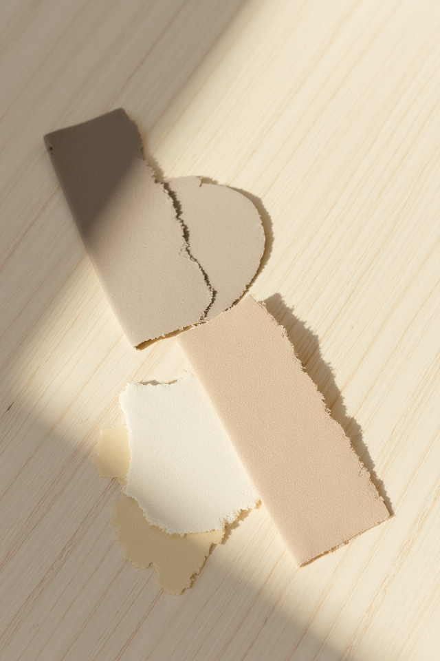
True Japandi lives in a specific slice of the color wheel — warm grays, soft taupes, and muted earthy greens. Think SW Repose Gray for walls, not stark white. Think linen in natural oatmeal, not bright cream. The secret is temperature: every neutral leans slightly warm, never cold or clinical.
- Wall colors: SW Accessible Beige, BM Balboa Mist, SW Agreeable Gray
- Accent tones: sage green, clay terracotta, charcoal gray
- What to avoid: pure white walls, cool grays, anything with blue undertones
The Japanese side brings in deeper charcoals and blacks as intentional accents. The Scandinavian side keeps it light and breathable. When they meet in the middle, you get rooms that feel grounded but never heavy.
2. Light Wood vs. Dark Wood: The Japandi Decision
This is where most Japandi attempts fall apart — mixing the wrong wood tones.
Japandi strictly favors light to medium woods with visible grain. White oak is the hero. Ash, beech, and light walnut work beautifully. What doesn’t work: dark espresso finishes, orange-toned pine, or anything with a glossy polyurethane shine.
- Best woods: white oak, ash, light walnut, Japanese cedar
- Finish: matte or natural oil, never high-gloss
- Grain preference: visible but not dramatic — subtle linear patterns
Why Light Wood Wins
Japanese design prizes the natural aging of materials. Light woods show their patina over time — they get richer, not duller. Scandinavian design wants brightness and airiness. Light wood delivers both without sacrificing warmth. A white oak dining table or ash bench becomes the visual anchor without dominating the room.
3. The Wabi-Sabi Principle: Imperfection as Beauty
If your wood pieces look too perfect, you’re doing Japandi wrong.
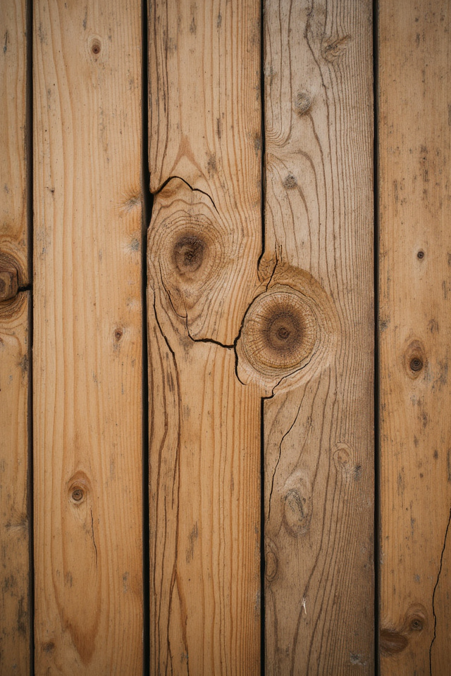
Wabi-sabi is the Japanese art of finding beauty in imperfection and impermanence. In Japandi rooms, this means celebrating knots, natural cracks, and variations in grain. A live-edge shelf with bark still attached? Perfect. A smooth sanded board with no character? Doesn’t belong here.
- Seek out: live edges, visible knots, natural splits stabilized with resin
- Embrace: color variation within the same wood piece
- Skip: perfectly uniform lumber, filler-patched knots, stained consistency
This philosophy extends beyond wood. Handmade ceramics with slight wobbles. Linen with natural slubs. The goal isn’t messy — it’s authentically imperfect. You can find beautiful wabi-sabi inspired wooden trays and bowls on Amazon in the $30-50 range; look for descriptions mentioning “natural edge” or “organic shape.”
4. Shoji-Inspired Elements Without Actual Shoji Screens
You don’t need to install traditional Japanese screens to capture the aesthetic.
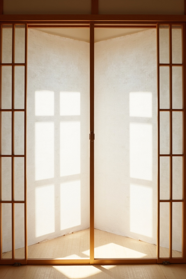
The shoji concept — diffused light through natural materials — translates beautifully into Japandi through wooden slat room dividers, slatted headboards, and open shelving with visible wood framework. The key is creating visual breaks without solid barriers.
Modern Shoji Alternatives
- Vertical wooden slat dividers between spaces
- Open wooden shelving units that don’t reach the ceiling
- Slatted bench backs or bed frames
- Wooden dowel curtain rods left exposed as design elements
These pieces filter sightlines the way traditional shoji filtered light. Your eye moves through them, not around them. Rooms feel larger and more connected while maintaining distinct zones.
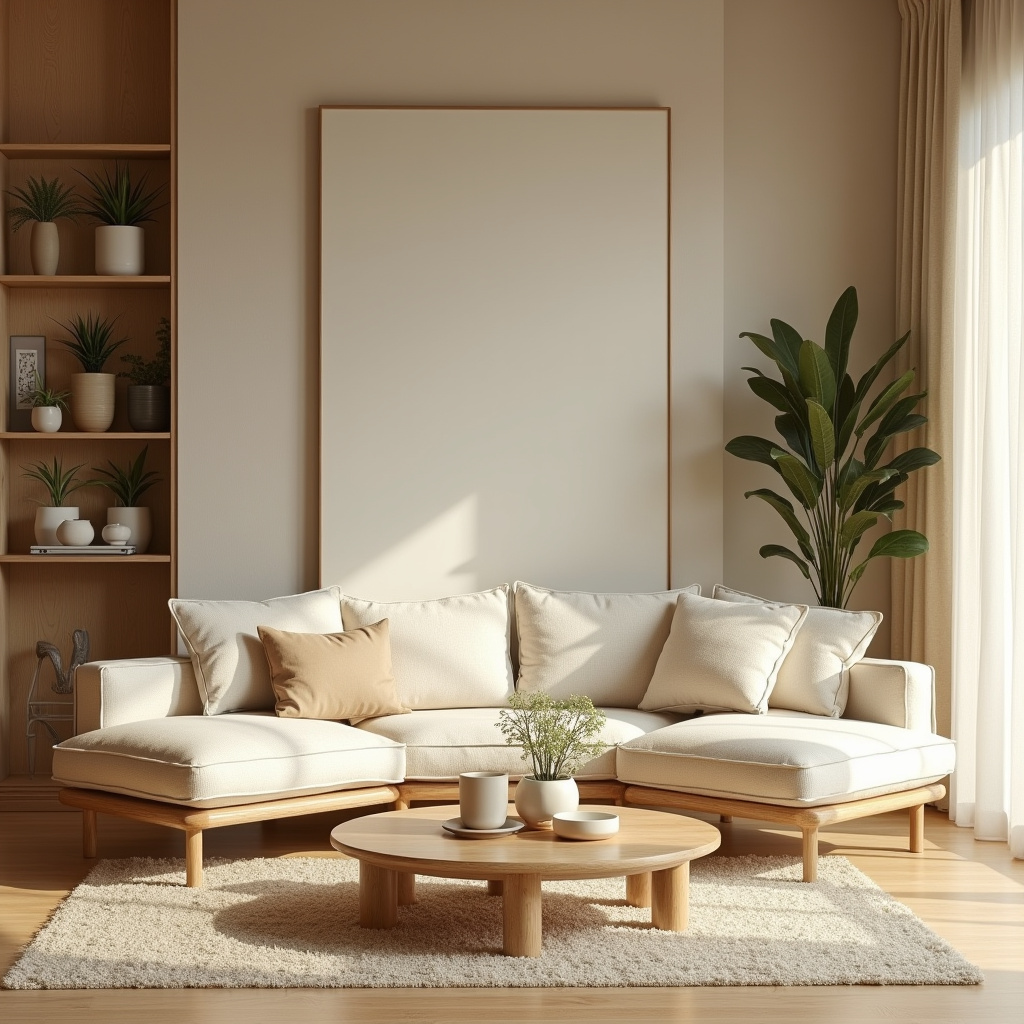
5. Textile Pairings: What Goes With All That Wood
Wood alone reads cold. Wood with the right textiles reads Japandi.
The magic combination: natural linen, organic cotton, and handwoven textures in neutral tones. No polyester. No shiny synthetics. No bold patterns. The textiles should feel like they came from the earth just like the wood did.
- Linen: cushion covers, table runners, curtains in oatmeal or natural
- Cotton: chunky knit throws in cream or soft gray
- Wool: minimal geometric rugs in muted tones, not plush shag
- Jute: placemats, baskets, small accent rugs for layering
Color rule for textiles: if it looks warm next to your wood, it works. If it creates contrast instead of harmony, it doesn’t belong. A cream linen pillow on a light oak bench feels inevitable. A bright white pillow feels like a mistake.
6. The One Metal That Belongs in Japandi Spaces
Most metals fight with wood. One works perfectly.
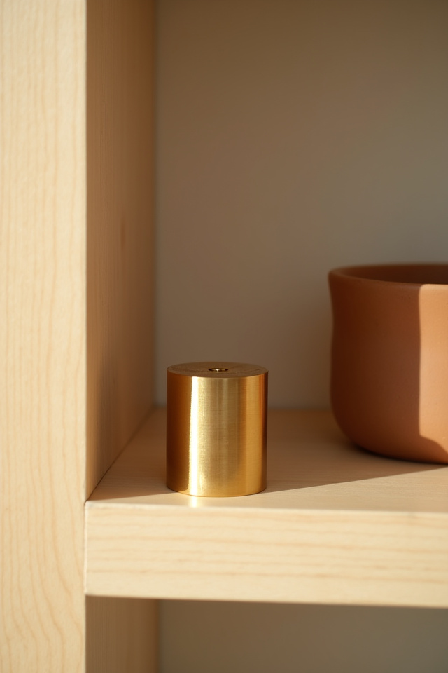
Matte black metal is the only metal accent Japandi truly embraces. Not brushed nickel. Not brass. Not copper. Black metal provides contrast without competing — it recedes visually while defining edges and corners.
Best Black Metal Applications
- Thin-profile cabinet handles and drawer pulls
- Minimalist light fixture frames
- Simple wall hooks and coat racks
- Hairpin table legs (but sparingly — wood legs preferred)
The black should be matte or satin, never glossy. Think blackened steel or powder-coated iron. The goal is shadow-like definition, not reflective shine. When you get it right, the metal feels like calligraphy on the neutral canvas of wood and textile.
You May Also Like
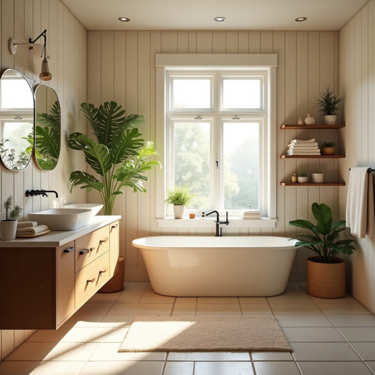
7. Low-Profile Furniture: The Height Rule Everyone Ignores
Japandi furniture sits closer to the ground than you’re used to.
This comes straight from Japanese design traditions — lower sightlines create calm. Platform beds instead of tall frames. Coffee tables under 16 inches high. Sofas with exposed wooden legs that keep the base visible and light.
- Bed frames: 10-14 inches off the floor, platform style
- Coffee tables: 12-16 inches, no taller
- Sofas: visible legs, not skirted bases
- Side tables: prioritize width over height
The Scandinavian contribution here is keeping those low pieces feeling airy, not squat. Tapered legs. Open space beneath. No bulky proportions. When you walk into a true Japandi room, your eye travels horizontally across surfaces instead of jumping up and down between furniture heights.
8. The Storage Philosophy: Hidden but Accessible
Clutter destroys Japandi faster than bad paint colors.
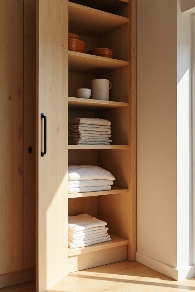
But Japandi storage isn’t about shoving everything in closets. It’s about intentional concealment with easy access. Wooden cabinets with push-to-open mechanisms instead of handles. Benches with lift-top storage. Floating shelves with a few curated items, not packed arrangements.
What to Store Visibly
- Handmade ceramics in neutral tones
- A small collection of books with spines covered in kraft paper
- Natural woven baskets (but only one or two per room)
- A single statement plant in a simple ceramic pot
What stays hidden: electronics, paperwork, daily-use items that aren’t aesthetically cohesive. The rule is simple — if it doesn’t actively contribute to the calm, it lives behind a door. Look for wooden storage boxes and trays on Amazon in light oak or walnut; the $25-40 ones with clean lines and no hardware work perfectly for corralling small items on shelves.
9. Plant Selection: Not Every Green Works
Japandi rooms need plants, but not the ones you think.
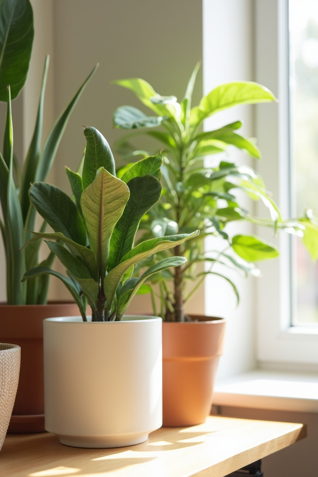
Skip the fiddle leaf fig. Forget the monstera. Japandi plants are architectural or delicate, never bushy or tropical. Think single-stem elegance or subtle groundcover textures.
- Perfect choices: snake plant, bamboo, bonsai, single-stem olive tree
- Subtle accents: pothos (trained up, not trailing wild), peace lily
- Avoid: anything with large variegated leaves, flowering plants in bright colors
Pots matter as much as plants. Ceramic in matte white, natural terracotta, or soft gray. Cylindrical or gently tapered shapes. No decorative patterns. No glazed colors. The pot should feel like a natural extension of your wood and neutral palette, not a contrasting accent.
10. Lighting: Warm White and Paper Lanterns
Harsh overhead lighting ruins Japandi ambiance instantly.
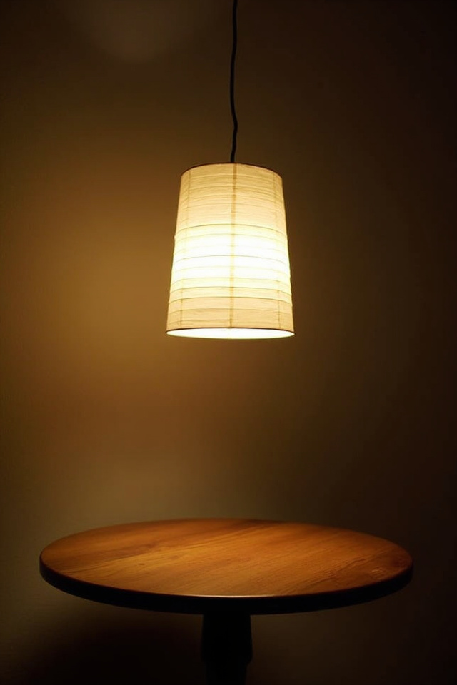
Japandi spaces glow, they don’t glare. This means warm white bulbs (2700K-3000K) and diffused light sources that create soft pools of illumination instead of bright floods. Paper lanterns are the classic choice, but modern alternatives work too.
Layered Lighting Strategy
- Overhead: rice paper pendant or simple wooden-framed fixture
- Task lighting: matte black desk lamps or wooden tripod floor lamps
- Ambient: LED strips hidden under floating shelves
- Accent: candles in simple glass holders (real flames preferred)
No exposed Edison bulbs — too industrial. No cool white LEDs — too clinical. No ornate chandeliers — too traditional Western. The goal is light that makes wood tones glow warmer and shadows softer. Dimmer switches aren’t optional; they’re essential.
11. Wall Treatment: The Space Between Minimalist and Bare
Blank walls aren’t Japandi. They’re just unfinished.
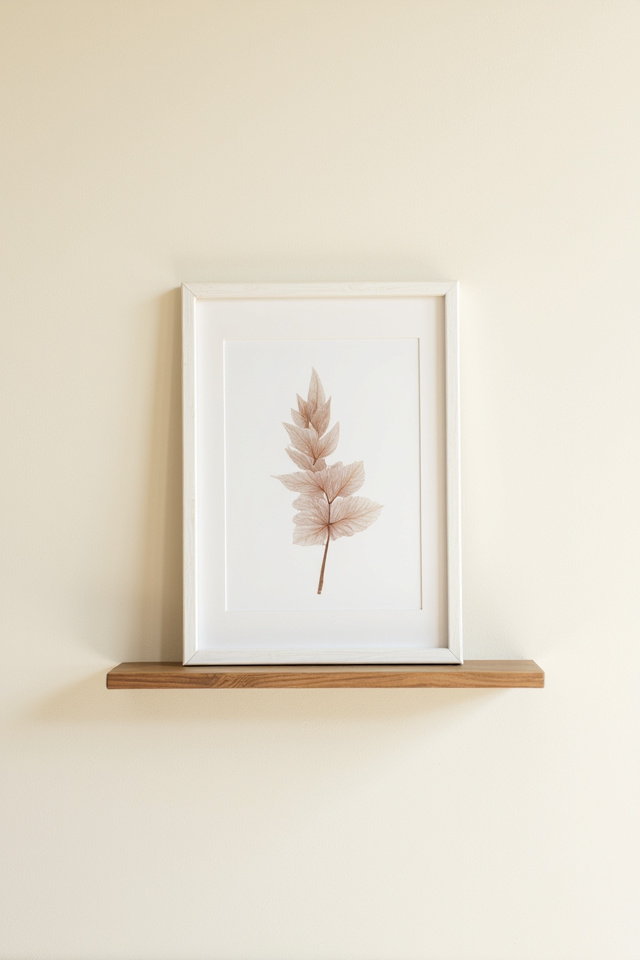
The distinction: Japandi walls have intentional negative space around carefully chosen pieces. One large-scale piece of art in natural tones. A floating wooden shelf with a single ceramic object. A woven wall hanging in organic fibers.
- Scale up: one large piece beats three small ones
- Frame choices: light wood, black metal, or no frame with raw edges
- Subject matter: abstract in earth tones, landscapes, botanical line drawings
- Avoid: gallery walls, photo collages, anything in bright matting
The Japanese concept of “ma” — meaningful emptiness — means the space around your wall art is part of the design. Don’t fill it. A single wooden floating shelf in white oak with 18 inches of empty wall above and below creates more visual impact than a densely decorated wall ever could.
12. The Breakfast Nook Formula: Wood Table Plus Two Elements
Small dining spaces are where Japandi principles shine brightest.
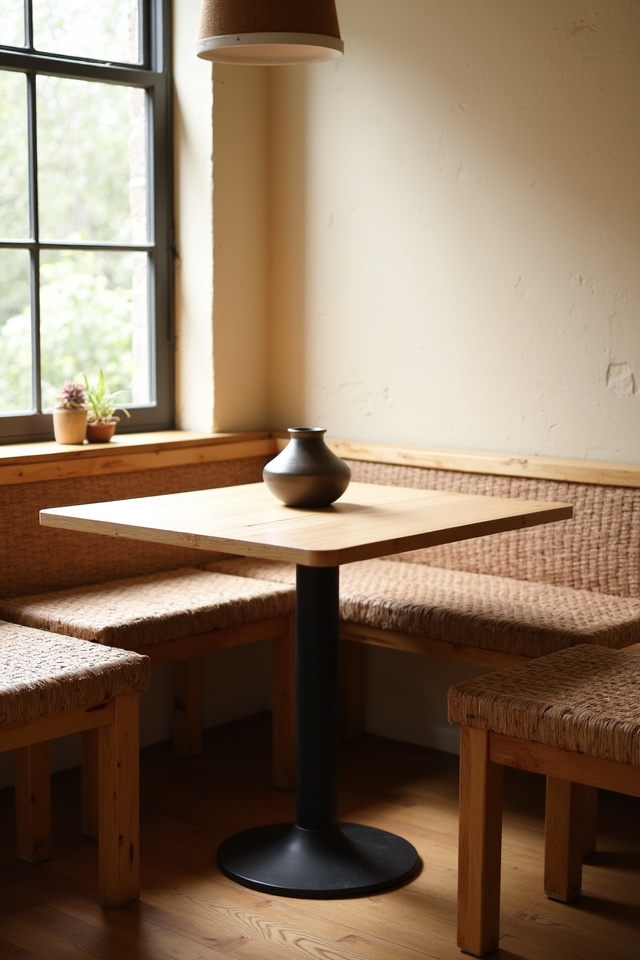
The formula is almost mathematical: light wood table plus simple seating plus one organic centerpiece. That’s it. No placemats unless they’re natural linen. No decorative chargers. No fussy arrangements.
Choose a white oak or ash dining table with clean lines — rounded corners preferred over sharp edges. Pair with wooden chairs (Windsor-style in natural finish works beautifully) or upholstered seats in oatmeal linen. Your centerpiece? A shallow wooden dough bowl with seasonal fruit, or a single ceramic vase with one stem.
Best Paired With
- Walls: SW Repose Gray or BM White Heron
- Lighting: paper lantern pendant centered over table
- Flooring: light blonde hardwood or natural fiber rug
You May Also Like
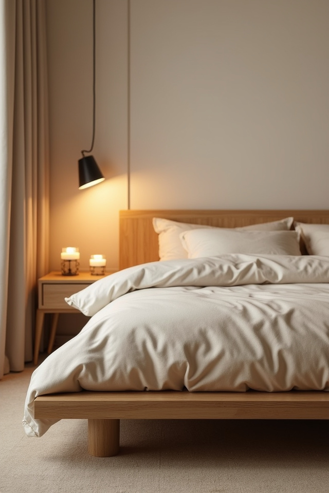
13. Bedroom Essentials: Platform Bed and Breathing Room
Japandi bedrooms feel like you exhaled the second you walked in.
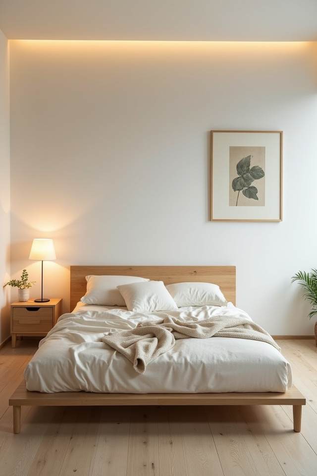
Start with a low platform bed in light wood — no headboard, or a simple slatted one that doesn’t tower. Bedding in white, oatmeal, or soft gray linen. One lightweight throw at the foot, folded simply. That’s the base layer, and it’s already enough.
- Nightstands: floating wooden shelves or simple side tables, one per side maximum
- Lighting: wall-mounted swing-arm lamps in matte black
- Decor: one plant, one small ceramic object, nothing else
The floor stays mostly clear. No benches at the foot unless you use them daily. No decorative ottomans. No extra chairs “just in case.” Japandi bedrooms reject the Western impulse to fill every corner. The empty space is the luxury.
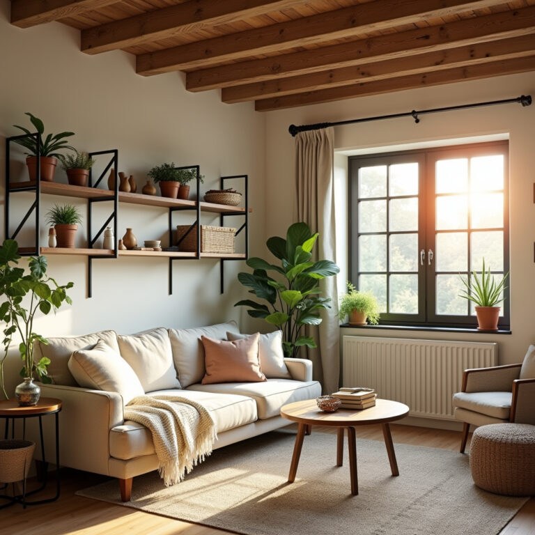
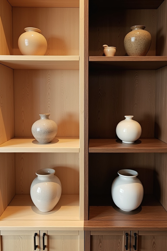
14. Open Shelving Done Right: The Three-Object Rule
Japandi shelving looks effortless because it follows invisible rules.
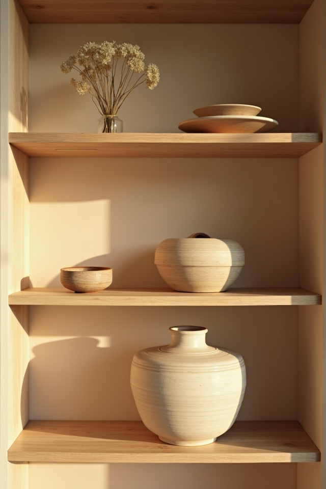
The core rule: no shelf holds more than three objects, and often just one. Group items in odd numbers. Leave negative space between groupings. Every object must earn its place through beauty or daily use — preferably both.
What Belongs on Japandi Shelves
- Handmade ceramic bowls or vases in matte finishes
- Small wooden boxes or trays for corralling tiny items
- Books with neutral spines or wrapped in kraft paper
- A single sculptural object in natural stone or wood
What doesn’t: colorful knick-knacks, framed photos in mismatched frames, collections of anything, decorative signs with words. If you find yourself thinking “this shelf looks empty,” you’re doing it right. Japandi shelves provide visual rest, not visual entertainment.
15. Flooring Choices: Light Wood or Natural Fiber
Your floor is the largest surface in any room. Get this wrong and nothing else works.
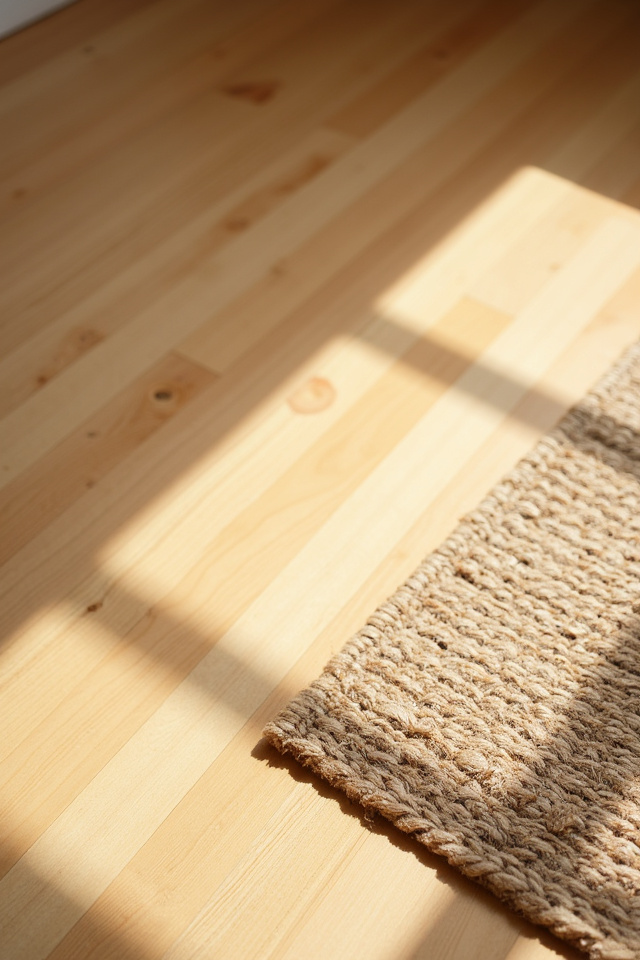
Japandi floors skew light — white oak, light maple, or natural bamboo in wide planks. Matte finish only. If you’re stuck with darker floors, layer a large natural fiber rug in jute or sisal to lighten the base and create visual cohesion with your furniture.
- Best hardwoods: white oak, light ash, natural bamboo
- Rug materials: jute, sisal, wool in solid neutrals
- Avoid: dark stains, glossy polyurethane, patterned area rugs
The floor should feel like it’s made of the same material family as your furniture — all organic, all warm, all speaking the same visual language. When floors compete with furniture for attention (think honey oak floors with walnut furniture), the whole Japandi balance collapses.
16. The Pottery Statement: One Large Vessel
Every Japandi room needs at least one piece of substantial ceramic art.
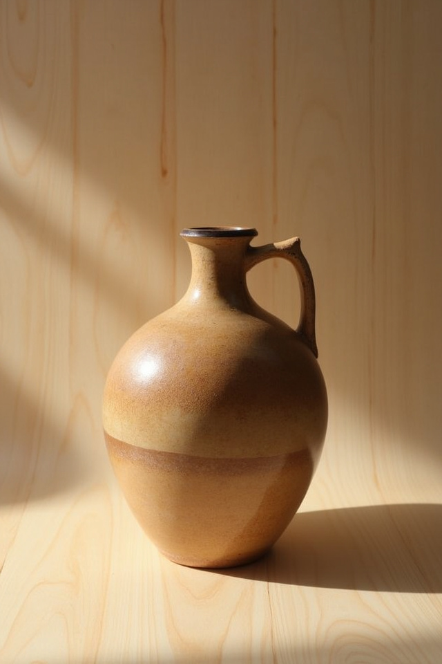
Not a collection of small pots. One large handmade vessel that becomes a focal point through its simplicity and scale. Think a wide ceramic bowl in matte white sitting on your coffee table. A tall cylindrical vase on the floor next to your sofa. An oversized planter housing your single statement plant.
The pottery should show subtle imperfections — finger marks in the clay, slight wobbles, variations in glaze thickness. Mass-produced perfection doesn’t belong here. You can find beautiful artisan-style ceramic pieces on Amazon in the $40-70 range; search for terms like “handmade pottery” or “rustic ceramic” and prioritize pieces with visible texture and organic shapes.
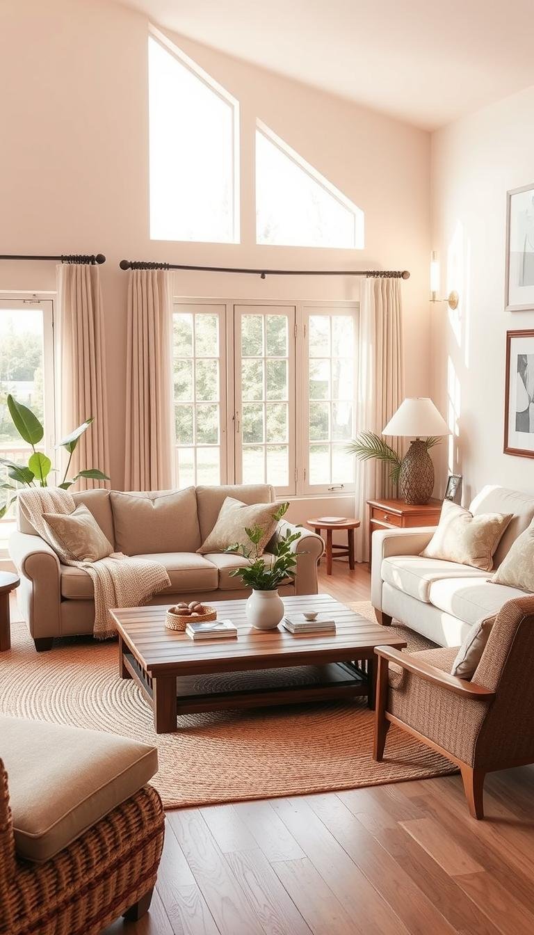
17. Window Treatments: Sheer Linen or Nothing
Heavy drapes suffocate Japandi light.
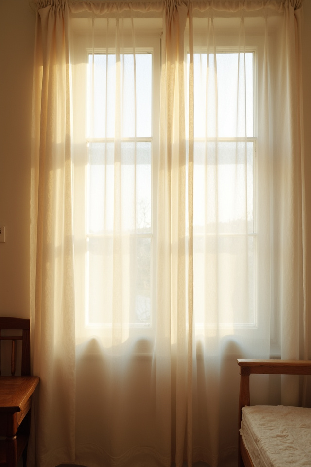
Japandi windows either stay bare (if privacy allows) or get dressed in sheer natural linen curtains that filter light without blocking it. The curtains
To bring you cozy inspiration more efficiently, we sometimes use AI to assist in content creation — but every word and idea is carefully shaped by our team. See our AI Disclosure for more info.