This post may contain affiliate links. If you click and buy, we may earn a small commission at no extra cost to you. Learn more.
You bought the rustic wood shelves. They’re gorgeous — thick grain, warm tone, exactly what you pinned 47 times. Then you hung them up and… something’s off. They don’t pop the way they did in the Pinterest photo. The wood just kind of sits there.
Here’s the secret: rustic wood shelves don’t style themselves. The color behind them, around them, and on them makes all the difference. Get the palette right, and those shelves become the focal point you imagined. Get it wrong, and they disappear into visual noise.
These four color palettes work every single time — and they’re forgiving enough that you don’t need a design degree to pull them off.
Contents
1. White Walls + Warm Wood + Black Accents
This is the palette that makes reclaimed wood shelves look like they belong in a magazine spread.
The reason this combo works is contrast without chaos. White walls let the wood grain become the texture, while black accents add weight so the shelves don’t feel like they’re floating in a cloud. Think matte black picture frames, a black ceramic vase, or even just black-and-white book covers stacked horizontally.
The best wall whites for this look:
- SW Pure White — crisp but not sterile, makes walnut shelves glow
- BM Chantilly Lace — soft white that works with any wood tone
- SW Alabaster — warmer base, perfect if your shelves lean orange-toned
What to Style On the Shelves
Keep it minimal. A white ceramic pitcher. A small black lantern. A linen-bound book. Maybe one trailing pothos. The wood does the talking here — everything else just listens.
If you’re looking for those matte black metal frames, Amazon has sets in the $30-40 range that look way more expensive than they are. Search for “matte black gallery frames” and grab a mix of 5×7 and 8×10 sizes.
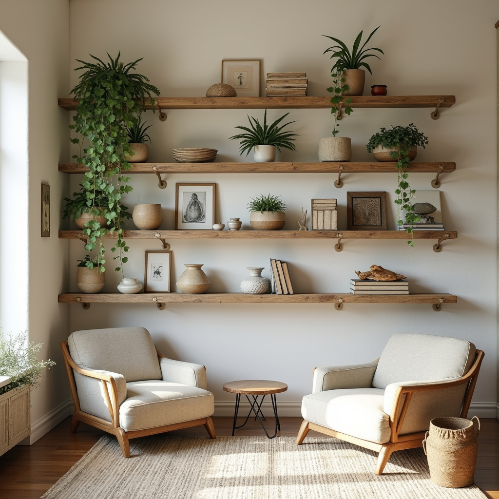
2. Greige Walls + Light Wood + Cream Textures
This palette whispers instead of shouts, and that’s exactly why it works for people who want calm over drama.
Greige (that gray-beige hybrid everyone’s obsessed with) is the most forgiving backdrop for wood shelves because it has enough warmth to support the wood but enough gray to keep things modern. Pair it with lighter woods — white oak, ash, or pine — and layer in cream-colored objects for that cozy-but-clean aesthetic.
Best greige shades to try:
- SW Repose Gray — the goldilocks greige, works with everything
- BM Revere Pewter — slightly warmer, pairs beautifully with honey-toned pine
- SW Agreeable Gray — soft and neutral, never reads cold
Best Paired With
Cream linen baskets. Ivory candles in low ceramic holders. A chunky cream knit throw draped casually. Maybe a small dried pampas arrangement. This palette thrives on texture over color — everything’s in the same tonal family, but nothing’s flat.
One styling trick that makes this palette feel intentional: use odd numbers. Three cream pottery pieces look curated. Four looks like you ran out of ideas. Stack books in threes, group candles in threes, arrange objects in triangular compositions.
You May Also Like
3. Charcoal Gray + Dark Wood + Brass + Green
For the person who wants rustic but refuses to go full farmhouse, this palette is your answer.
Dark walls feel risky until you see them with dark wood shelves — then suddenly everything clicks. The key is adding brass and greenery to lift the mood so the space doesn’t read like a cave. The charcoal makes rich walnut or espresso-stained shelves look like sculpture, and the brass catches light in a way that makes the whole vignette feel alive.
Try these moody grays:
- SW Iron Ore — deep charcoal with warm undertones, stunning with walnut
- BM Kendall Charcoal — classic dark gray, never flat or muddy
- SW Urbane Bronze — almost black but reads as sophisticated gray-brown
How to Style It Without Overdoing It
This palette can tip into heavy if you’re not careful. Balance is everything. One large brass candlestick. A brass picture frame or two. A pothos or philodendron trailing down. Maybe a stack of books with green spines. You’re not decorating a shelf — you’re creating a focal point that draws the eye and holds it.
Brass candlesticks in the $20-35 range on Amazon are everywhere right now, and honestly, the quality is solid. Look for ones with a brushed or antique finish — shiny brass reads too traditional for this look.
4. Soft Sage + Natural Wood + White + Woven Textures
This is the palette for anyone who saved “organic modern” and “earthy minimalism” boards on Pinterest.
Sage green walls have taken over for a reason — they make natural wood look like it grew there. There’s something about that soft green-gray that feels like bringing the outside in, and when you pair it with raw or lightly finished wood shelves, the effect is instant calm. Add white ceramics and woven baskets, and you’ve got a space that feels collected, not decorated.
These sage shades work beautifully:
- SW Clary Sage — soft and muted, never too green or too gray
- BM Saybrook Sage — slightly more pigment, gorgeous with oak shelves
- SW Svelte Sage — lighter and airier, perfect for smaller spaces
Best Paired With
White ceramic vases — the simpler the better. Woven seagrass baskets for storage. A small olive branch or eucalyptus stem in a bottle. Linen-covered books. This palette loves natural, unfinished textures — nothing too polished, nothing trying too hard.
One subtle move that elevates this look: vary the heights. A tall white ceramic bottle next to a low woven basket next to a medium wooden bead garland draped casually. Your eye moves through the arrangement instead of landing flat.
Amazon’s full of affordable white ceramic vases right now — the $18-28 range gets you quality that looks like West Elm. Search “modern white ceramic vase” and grab two or three in different shapes.
Why This Palette Works for Renters
Sage green is one of those rare accent wall colors that landlords usually approve because it reads as neutral enough. If you can’t paint, try sage linen curtains behind the shelves or a large sage area rug below. The color association still happens, and the wood shelves get that organic lift.
The other win here: this palette grows with you. Start with white ceramics and woven baskets from Amazon. Later, add vintage finds or artisan pottery. The foundation stays the same.
The right color palette doesn’t just make your rustic wood shelves look good — it makes them feel intentional. Like you didn’t just hang shelves. You designed a moment in your home that people notice.
Start with one palette from this list. Style it simply. Give yourself permission to move things around until it clicks. The best shelves aren’t styled once and forgotten — they evolve as you do.
Save this for later — and explore more at The Woodworking Wonders.
To bring you cozy inspiration more efficiently, we sometimes use AI to assist in content creation — but every word and idea is carefully shaped by our team. See our AI Disclosure for more info.